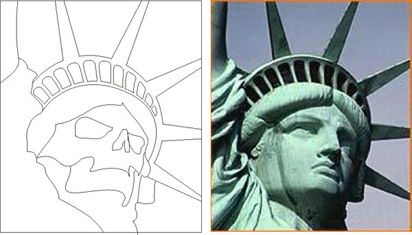
For this project I really wanted to do something with the Statue of Liberty as a foundation but I was looking for something a little more thought provoking than a simple replication of an image. I started with a reference photo of Miss Liberty, imported it into CorelDRAW and then used the basic proportions and sense of perspective for the foundation of the design I ultimately ended up with.
1. The extreme angle of the statue forces the composition to contain primarily sky. I laid out my Liberty mask and went to work on the sky.
2. I begin by loosely sketching in the clouds. I put the clouds in at somewhat of an “off direction” to work with the sense of perspective that complemented the position of the statue. Since the clouds will be worked considerably throughout the process, at this time I really want to focus on the edge of the clouds, starting to make them very light. For this piece, the clouds will actually be darker than the sky, giving it a more “stormy” effect.
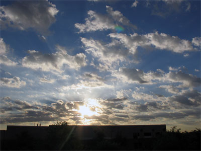
NOTE: For painting scenes such as sky and clouds, find and use good reference images. Keep an eye on the world around you. Open your eyes and notice how light and shadow work in nature. Take pictures. Look at the sky. The reference photo I used for this mural came from a particularly interesting sunrise we had a while back. I was driving in to the shop and was amazed at what I saw. I called Diana and had her run out on the balcony to take pictures. We do this quite often – take pictures of nature to use as reference for texture and realism.
3. Here I am building the brightness and contrast in the sky. I rely on the reference image quite a bit for this part of the job.
4. With the sky pretty much wrapped up with white, I start in on the statue, first with the crown area. I have established my primary light source as being directly in front and a little above the statue. Always keep your primary light source in mind as you build your white under painting.
REMEMBER: The mix and viscosity of your white is key! Your paint should be properly reduced and then thinned and strained to provide a smooth flowing and slow building cover.
5. Using a loose hand shield and my white, I create the bevels and edges of the crown. Notice the "hot spots" of light keeping true to the established primary light source.
6. Stepping back a bit you can see the headdress is pretty much complete now, and I have added some lightening in the bright spot in the sky. I am ready now to get started on the face.

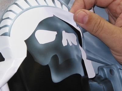
7. I start by removing the upper part of the facial mask. I am just ghosting over the shape, being sure to hit the edges to provide a rough placement guide for the design.

8. Here I am removing the bottom half of the jaw. You can see how light the ghosting is, but that it gives me a "line" to work with as a guide. I keep it very light because I DO NOT want it to look like a stenciled airbrush design, I just want it as a guide.
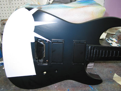
NOTE: You may wonder why I bothered to create this mask – why take the time, knowing that I could very well do the face free hand. Well, there are several reasons actually. This particular piece is a prototype for a short run of Jackson Custom Shop Guitars, so the possibility of doing 10 of these is very real. Also, as you know I am doing a lot of instructing, a lot of How Tos and I want to be able to give you files to work with to improve your skills. There is another very important reason or 2 that we will hit on later in the tutorial. All that being said, however, the actual drawing time I have in this design is no more than 5 minutes, with less than a minute to cut. I do not find it a waste of time at all.

9 & 10. These images really just show how I continue to use the mask as a very simple guide for placement. Notice in just a minute I have a very nice layout for my skull.
11. After peeling the eyes and hair I am left with this rough guide. It is relatively light, but I have not really done any shading or shaping at all at this point.
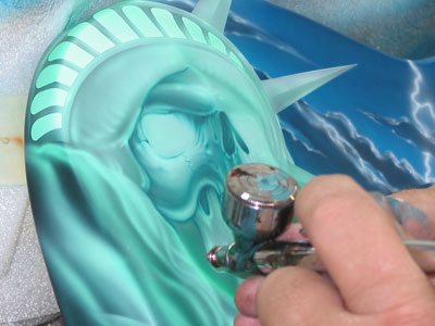
12. Now ready to really develop the face, I start by whiting out the eyes to create a sinister glow. I then start working the whole face. I am conscious of my primary lighting source, and have created a secondary light from the lightening shooting out of the sky to the right. This will illuminate the face as well and will create a very interesting effect. I have very extreme lights and they are contrasted sharply by very extreme darks. I use these values to shape and render the skull.
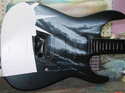
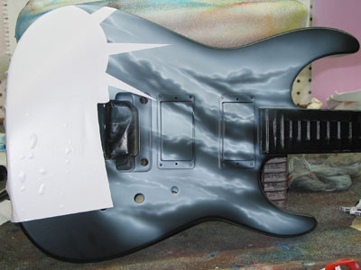
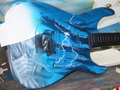
13. As I further develop the design I will move down to start creating the ripples and lighting in the robe. Obviously I have changed the position of the statue arms, and I did have to black some of the area out to do that.
14. Notice how I do a really light sketch with airbrush first to give rough position, and then develop and degrease the area. Once the guides are set in this manner, I go in to do the more finalized rendering.
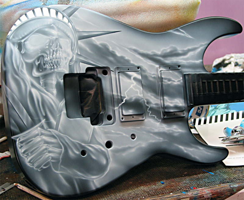
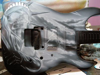
15. Here the white is pretty much done. Pay particular attention to the light sources.
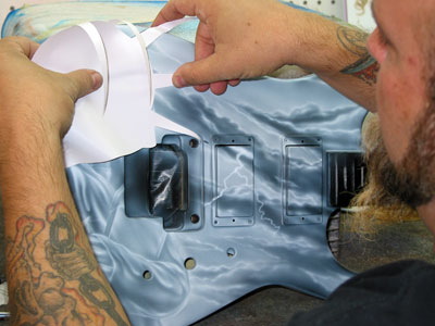
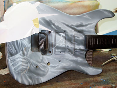
16. Now I am ready to start in with my kandy colors. I cut a new mask and replaced it over the statue to protect her from overspray. I will be using colors that I do not want on her.
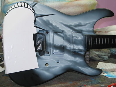
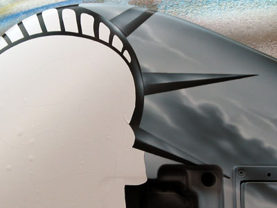
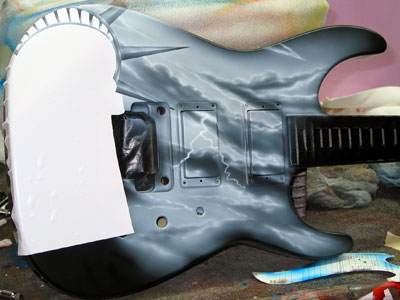
17. This step right here is another great reason for using a stencil and a computer. I have the shape completely and perfectly available to me. I waste no time re-cutting, fine lining or messing with any other method of masking.
18. I used clear transfer tape on the robe because I had left that area unresolved in my computer rendering. I was not sure at the time exactly how the statue was going to interact with the guitar shape, so I left it as a blank square.

19. I have given my sky area a light wash of kandy blue SEM over the entire area. Then I went in with a purple and black mixture to darken the clouds up a bit. I use the darker color to create dimension and shadow the edges of the clouds. Once the shapes were complete, I went back in with my white and reworked the lightening and the illumination that it would provide.
NOTE: I am able to put white on top of kandy and keep its brilliance because the kandy was very very light and have kept the mix at less than 20%. If you are not careful, you can experience bleed back doing this, and it can also show up at the end with clear. Be very mindful of your mix. If you are not sure, lock it down with intercoat clear.
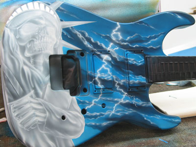
20. Here have removed the masks protecting the statue. As get ready to apply the first color on Miss Liberty, it is a perfect time to degrease the surface and tack off. You do not want to build your colors on top of dried white residue. Keeping your surface clean is crucial to the quality and longevity of a job.

21. I start the detail work with a very thin SEM Shamrock Green kandy. I use this color to render some of the darker areas, but primarily am just going over the whole thing with a light wash.
22. Once completed the wash, mixed up my second color, and opaque mix of green, blue, black and white. This is my detail color and will finish the rendering of the statue with it.

23. Here you can see a test spray of the color am using for detail. I wanted to use a green color all the way through the design because felt that it would render the oxidation of the copper the best. Black would just be too harsh.
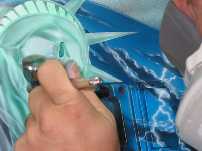
24. I am not using any guide persey, just following the general rules and design that I have established with the white. I do refer to my photo reference for some of the shading and undulations of the robe itself.
25. I continue to work along the edges shaping and carving the design. I continue to follow the contrast guidelines that were set with the white. I do use some loose hand shielding .
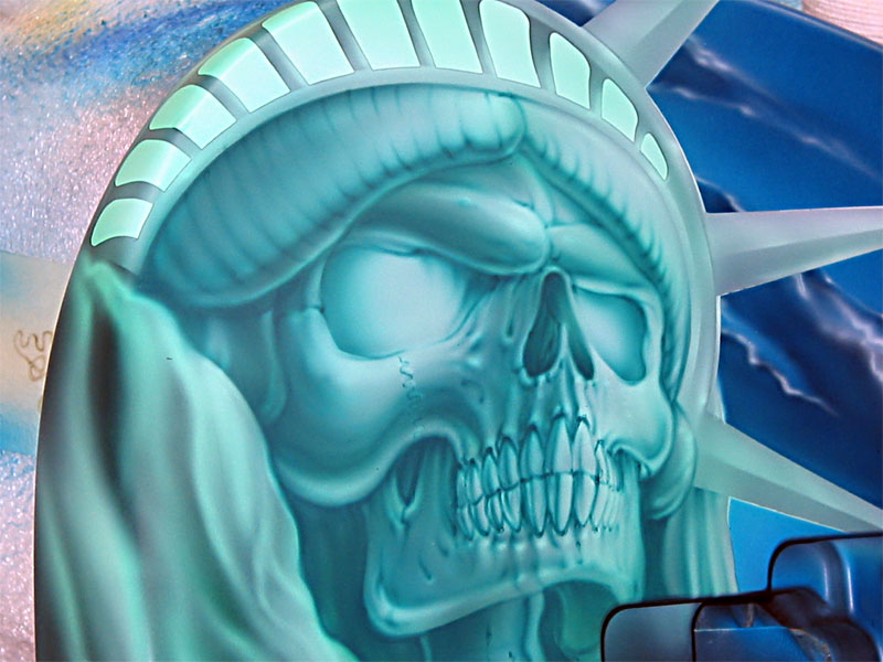
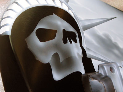
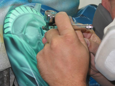
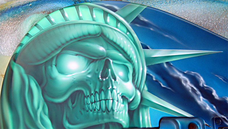
Close up detail shot of the face.
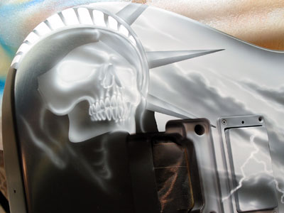
27. Here she is pretty much done with just he hand left to render.

28. Here I added just a "skosh" of purple to do some final detail. I used this color to richen up some of the more extreme dark areas around the nose, hairline and in the inner eyes, etc.
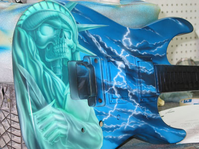
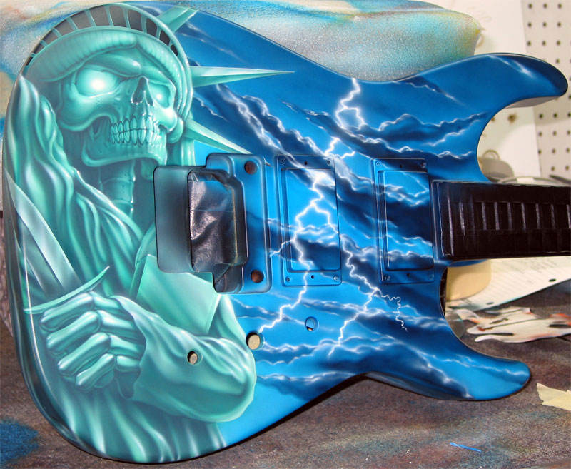
29. Here she is… Done except for final highlights.
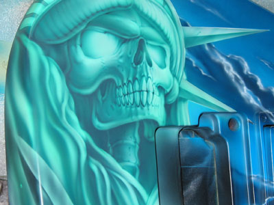
30. Back in with white I brighten the extreme highest – the cheekbone eyes and crown. Notice how I am sculpting the shape of the face with the emphasized lighting. Here the shapes are more important than the lines themselves.
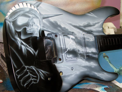
31. Done prior to clear.
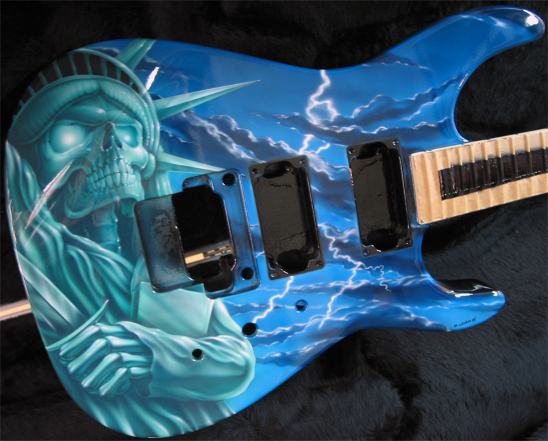
32. In clear and in the box.