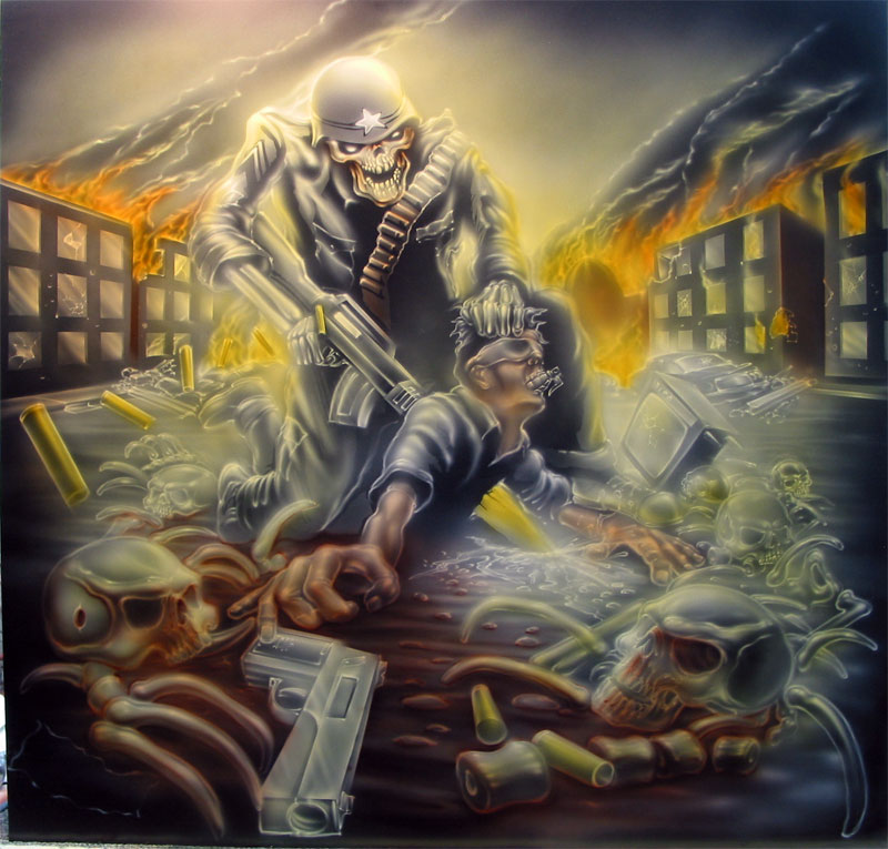
Album Cover Art
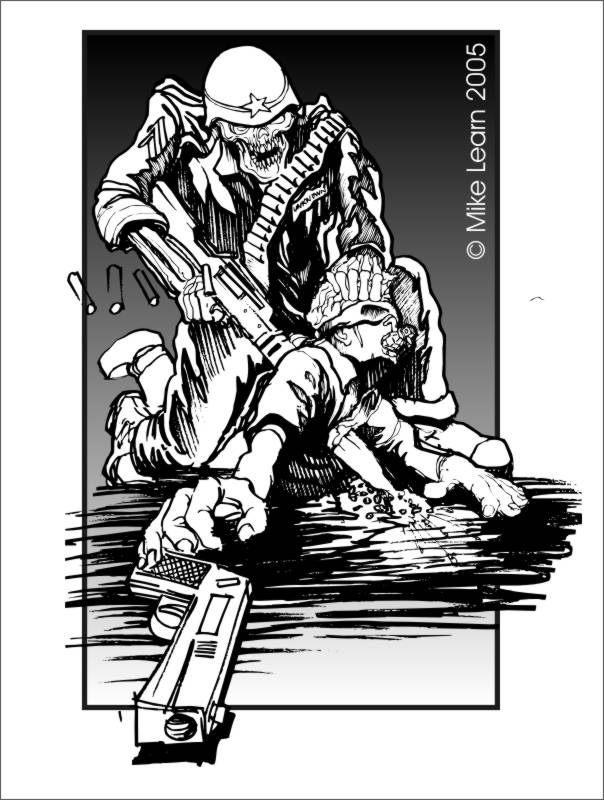
This project was for a band out of California. As I do with all Album Cover assignments, I started by listening to the music. They play a really hard core thrash metal and were looking for an image that reflected their style. They also wanted to make some sort of political statement, though exactly what, was left up to me. After a few days of thought and listening, I came up with the idea for the soldier character who seeks revenge for those who have been killed by terrorists.
I was very happy with my original sketch. I was able to capture the dynamics and tension in composition that I was aiming for. The power of the design is emphasized by the very strong sense of perspective and the solid, triangular composition. In this particular case, I liked the sketch so much that I did not want the painting to lose anything in the translation from idea to sketch to final product. I also wanted to test out a masking idea that had been floating around in my head.
I completed the pencil sketch, then inked it with a sharpie. We scanned the image and then I used Corel TRACE to capture the major shapes and elements in the design. From this I created a vinyl mask in the Compu-sition style.
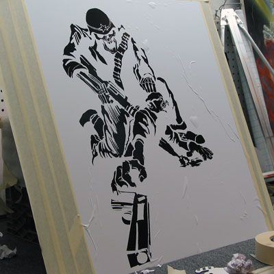
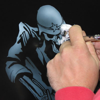
1. Here you can see what the mask looked like. I am working on a 2′ by 2′ piece of sheet metal. This project became kind of an “map” project to push the limits of this Compu-Sition style masking. I will approach the technical part of the design in much the same way that we are approaching the use of the stencils. I am very pleased with the way the drawing is mapped out.
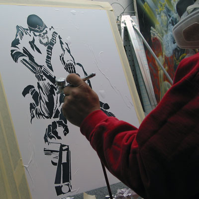
I start with the white (as always) and give the entire area a light ghosting. This will give me the “map”; that is the integral part of this process. With the mask in place, I start to add different intensities of white to begin to establish some of the initial focus and light source.
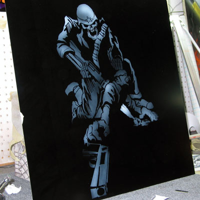
3. Here you can see the results of the initial white. I removed the mask and degreased the surface. At this time you will also want to use your tack clothe to clear the surface of any loose spray
4. Here I begin to go in and develop the “cut out” image working with some of the negative spaces left black by the mask. This is where the creative part of using the masks comes in to play. Remember, the whole idea behind the vinyl layout is to utilize your masked shapes as a “map” to guide you around the rest of the design.
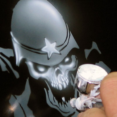
5. Here you can start to see some of the details that I am adding. Notice how I am softening things up a bit by not using any shielding in this area.
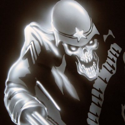
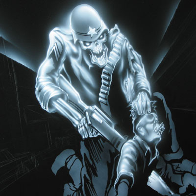
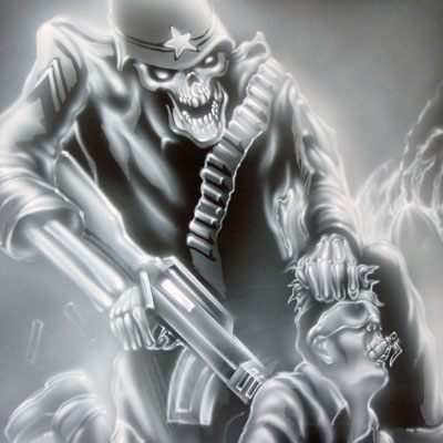
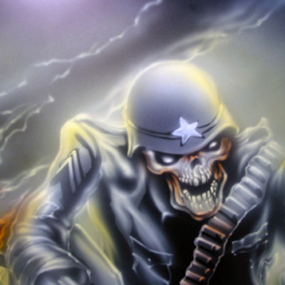
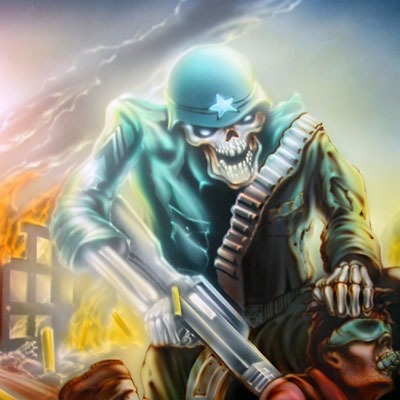
6. Using the basic techniques of airbrushing I begin to render the detail in the folds and the fabric. Here you can see how where the painting got its name “Corporal Punishment”. Our main character used
to be a sergeant, but was demoted at one time for impulsive behavior. You can see that he had a stripe removed.
7. Here you an see the image progressing. I have used some loose hand shielding on some of the edges of the weapon to keep it crisp. Also remember that what we are doing right now, as in all the other tutorials, is providing the groundwork and structure that we will follow throughout the rest of the painting. I am using the white to develop the shape and the form. Nothing I do from here on out will contradict what I am establishing with the white. </p>
You can also see some of the perspective lines that I used for some of the buildings that will be developed later. I added these lines simply , using a loose hand shield, I ghosted the lines in to help me with some of the dynamics of perspective.
8. Continuing on down into the terrorist I am keeping a strong sense of light coming from directly above as the main light source. Notice how easy it is to come in and completely rid the painting of the original stencil or mask that was used to generate the basic Compu-sition. Here you can see that I have started some sketching with a white Stabilo adding in some of the elements of the environment that will begin to see some development.
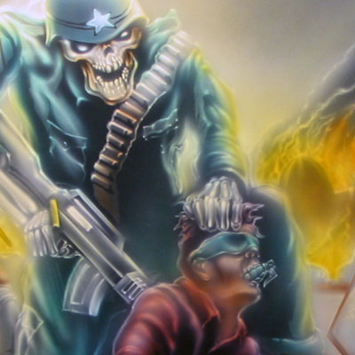
9. Here I am working with the hands. Notice how much larger the hand is in comparison to the rest of his body. It is certainly somewhat exaggerated from a perspective standpoint, but I also wanted to make it painfully obvious that this guy was going for a gun, despite the big hole in his chest. I probably do not need to mention that he also has a very bitter taste left in his mouth from the grenade stuffed down his throat
10. Here I am creating the strong focus on the muzzle blast coming out of the front side of the terrorist’s body. This is exaggerated even more by the black negative space to the left side of the blast. Here I am also working on some of the foreground elements. As I add in the foreground elements, I am cautious of the scale that these are drawn. I want to use them to help reinforce the sense of perspective.
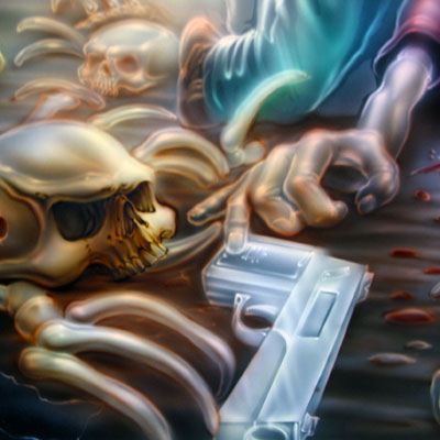
11. For the gun I used a razor blade and some loose shielding to keep the edges really crisp. You can also see the loose airbrush "sketching" that I laid out to provide composition for the left side of the foreground
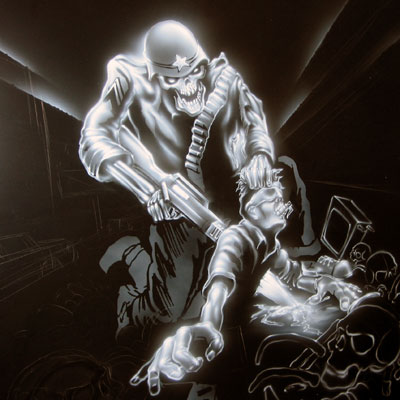
12. Here I have most of the foreground done and I begin to work on the background. You may have also noticed that I got rid of my ghosted perspective lines. Part of being an artist is having the flexibility to make those kind of changes when you want to. I just blacked them out and moved on.
13. Now I have redrawn my background and I am starting with some of the fire coming off the buildings and ejected casings. Again I am working with perspective as the bullet casings get large the “closer” they get to you.
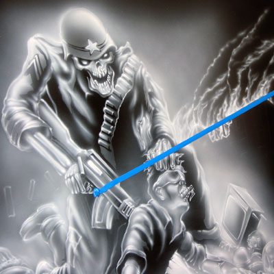
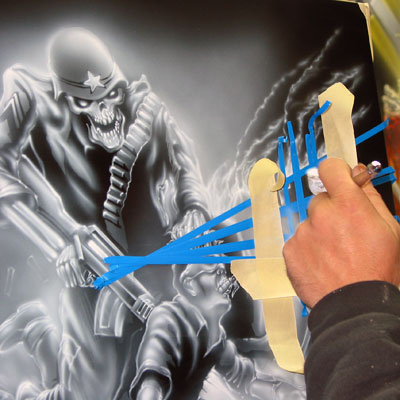
14. Here I started to use the blue fine line tape to establish my focal point. You will see it a lot in the next few images.
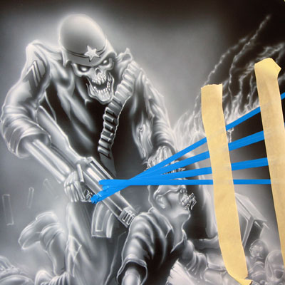
15. Here I am setting up for the windows in the building. I am using 3/4″ and 1/4″ tape to set up a “grid” for some of the architecture in the background.
16. What I am going to do here is spray in the reflection in the windows.
17. Here you can see the results after the tape was removed.. The rest of the building was created with the negative space left by the tape. The events I am painting are taking place at dusk, so the reflection in the glass would be strong with the amount of fire and burning that is going on all around. I use some loose hand shields to pick up the corners of the buildings and window casings.
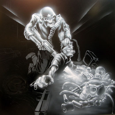
18. Here you can see that the image is coming together nicely. Rather than having the fire burn vertically, I wanted the piece to have the appearance of winds blowing the fire across the sky. Since the white base is nearly done, I will spend considerable amount of time right now making sure that I have established all the highlights that I want for the image.
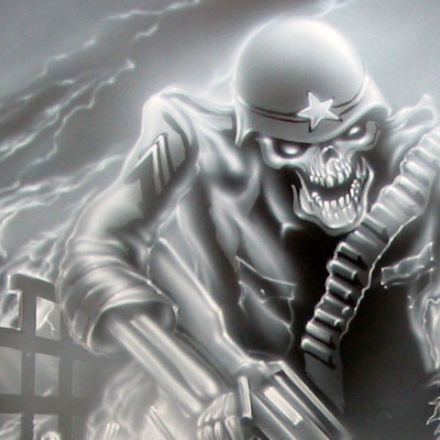
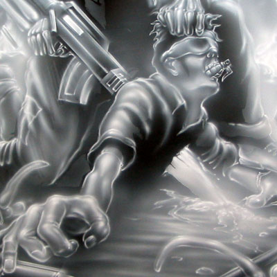
19 – 20. A few detail shots with the completed white. You can download a hi res complete white from the link below.
21. This image may look like we are jumping ahead, but really, this is not the case. This image shows the color placement of my 3 main color washes. The colors and order they were laid down are:
- Overall wash with sundance kandy. Sundance is the primary color of the background.
- Next the kandy tangerine was added to the flames and some additional glowing was added to the casings and some of the main reflections.
- Root beer kandy is the primary color of the foreground and was added last.
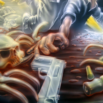
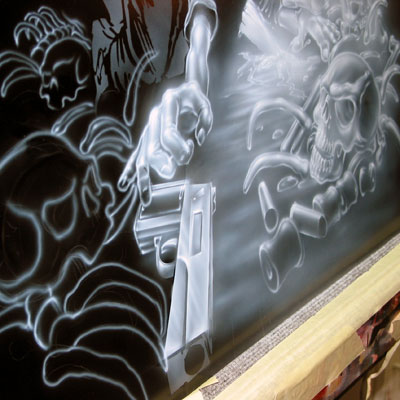
22. I got my flesh tones for this piece by mixing the kandy – a little bit orange and root beer. The bone color is primarily Kandy yellow with a bit of orange in some of the darker areas. Now I am going to use kandy root beer and some loose hand shielding and start to chisel out the area around the pistol and the casings and some of the other elements. Throughout this piece, there is a considerable amount of shielding used in a variety of forms to show the particular characteristics of the element being worked on, be it shinny, hard, round or otherwise.
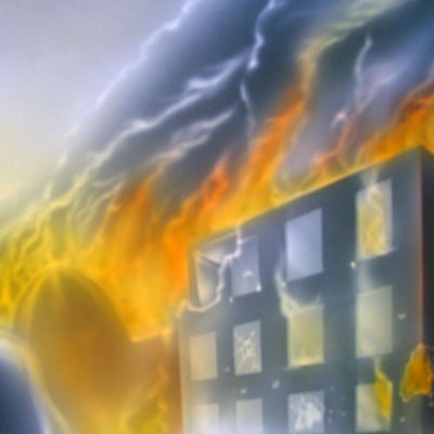
23. Here I have started to work on some of the background fire. I have done this with a mixture of oranges and yellow. I will come back in again with the white to emphasize some of theses elements later, but this is the first part of laying down the background glow.
24. Here is a detail shot of how I have used some of the kandy yellow on some of the lighter highlights in the foreground.
25. You can see that I have added a mint green light wash to the uniform of the corporal. I have also added kandy red to the shirt of the terrorist and the blood splatter in front of the blast. Look closely for an aorta. heheh.
26. Now I pretty much have all my washes in. I am going to begin some of the detailing. Notice here the green grenade, the green mask and a strong application of yellow in the highlights from the reflection of the burning background on the corporal and also in the brass casings being ejected from his gun.
27. For my detail color in the foreground I mixed a combination of root beer kandy , mint green kandy and some black basecoat. I am going to use a combination of loose hand shielding and free hand to develop and sculpt the base laid out in white. Again, let me emphasize that I am still following the initial guidelines that were laid out in the very first white. Notice here how the original mask lines and layout are not even evident.
28. I use the same dark detail color to develop and render the darker spaces and to create the folds in the uniform of our soldier
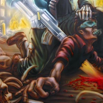
29. Here you can see further development and some emphasis on the contrast in front where the muzzle blast is exiting the chest of the victim. Also notice that I added shadowing on the edges of the red blood puddle. This gives depth to the bloody mess.
30. Here is the foreground just about wrapped up.
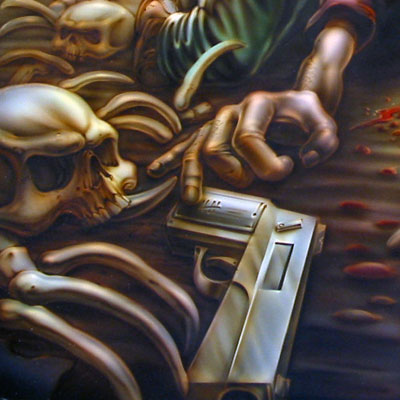
31. Here a detail shot of the gun. Notice the notch in the handle. The crisp edges were achieved with loose hand masking.
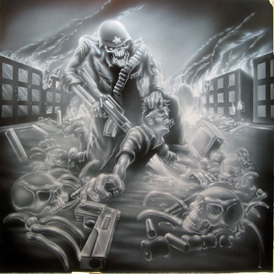
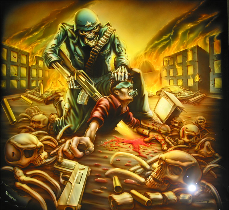
32. Here is the final before clear. Notice that I went back in and added highlights to help bring attention and focus to some of the areas. Notice that the contrast in the foreground is considerably higher than in the background. I achieved this by adding a little white to my dark detail color as I moved back in the painting.
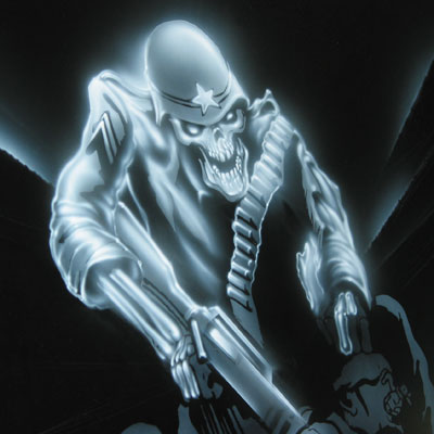
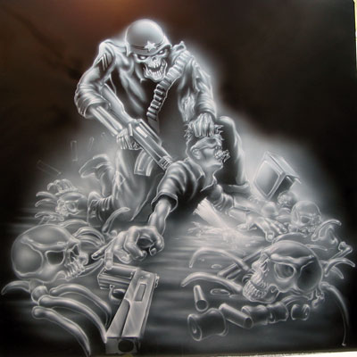
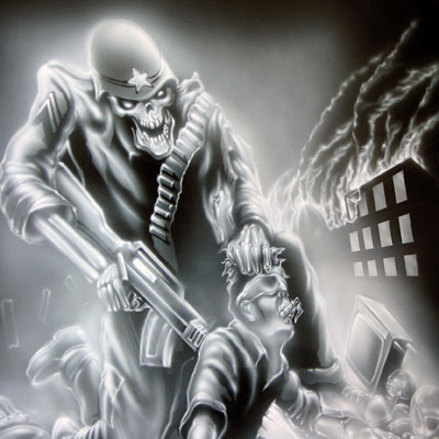
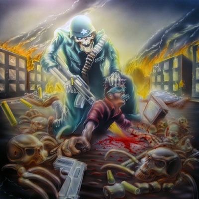
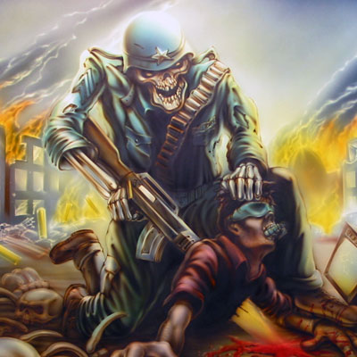
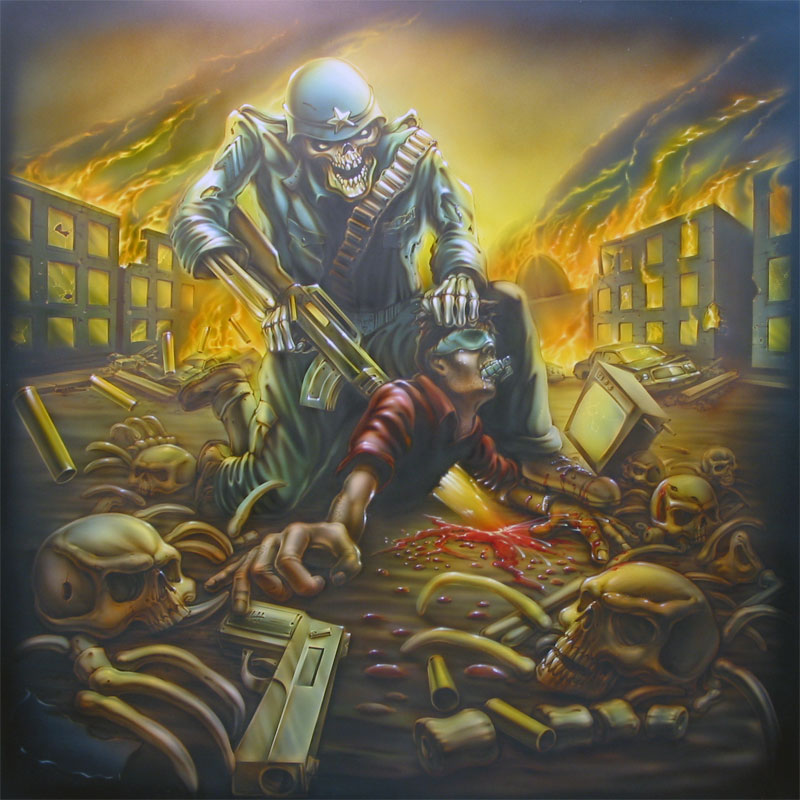
33. Final shot after clear. Notice how the use of contrast, perspective and composition all together have created a very unique piece fore my customer that not only satisfied them, but myself as well. Coming to a record store near you!
The moral of the story for this tutorial is this. Although this piece seems to be very advanced, it is really nothing more than a series of basic lessons, all of which have been covered over the last year on this site. DON’T BE INTIMIDATED BY YOUR IMAGINATION! If you have an idea, but are unsure of how to pull it off technically. Don’t worry, just do it. Everything you need is here on this site somewhere. After all, what is the worst thing that can happen?