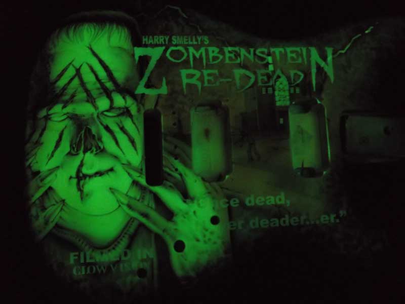
This is a project for NAMM. Mike always likes to push the boundaries a bit with these jobs because he is generally given full artistic reign. I thought you might like to follow the process of this piece, as it is challenging both technically and creatively.
As most of you know, Mike generally prefers to work on dark or black surfaces, but this instrument came to us white and he decided to go with something different. Inspired by the GID (Glow in the Dark) guitar he did for Phil Collen of Def Leppard last summer, he wanted to really challenge himself with a complex GID piece.
He sprayed the entire guitar body with HOK Long Glo. His idea is to have a vivid color palette in the light, while at the same time having a very sinister and detailed image in the dark.
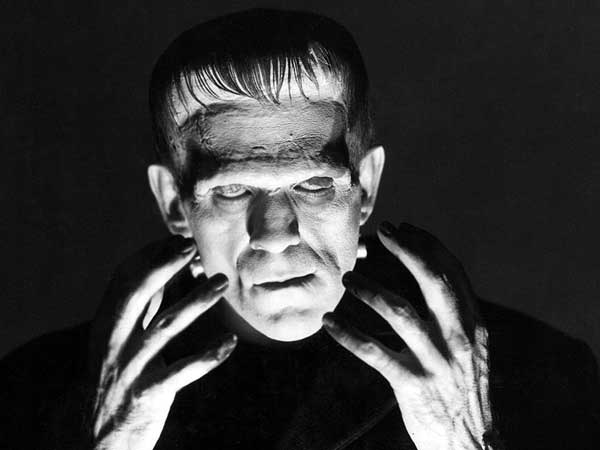
As reference materials he chose a classic pose for Frankie:
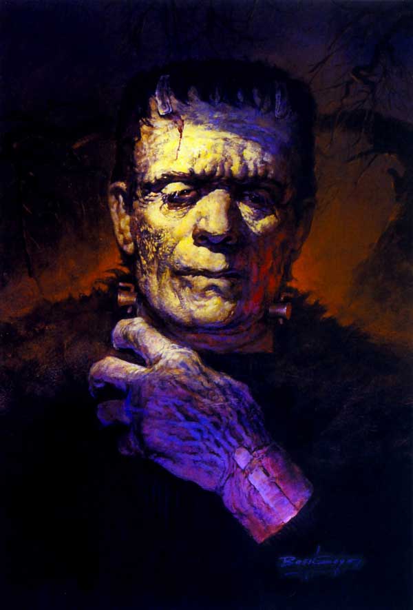
But with a bold color palette like this:
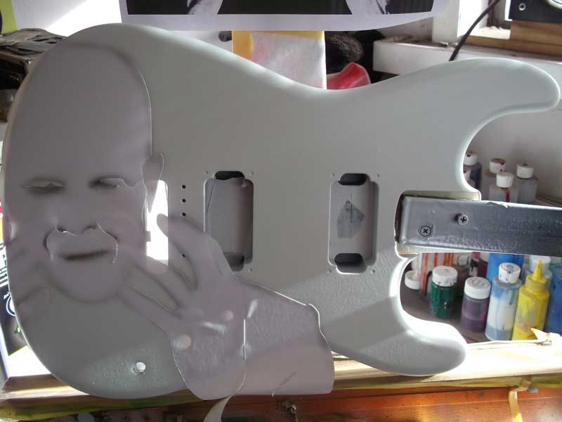
He started out creating a vinyl mask for the Frankie pose and then lightly created the outlines with opaque mix so the vinyl could be removed right away:
Using the black, he began working in the details. The challenge is to keep the GID paint as the highlights – so he has to be very careful not to spray over too much. There is little room for error as you cannot go back and correct with “white”.
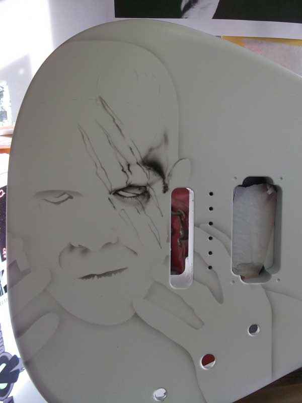
Continuing on with detail:
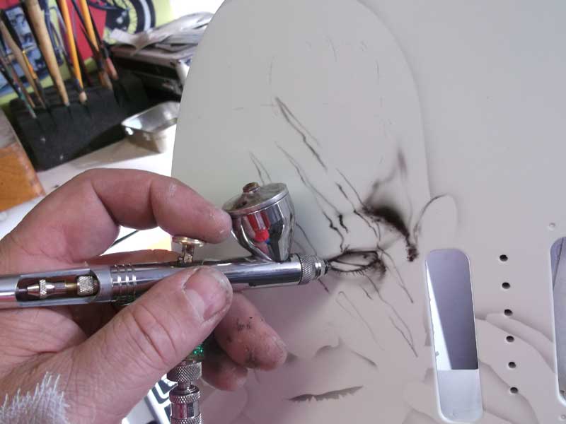
Here he is experimenting with kandies to add color, but will the GID show through the lighter tones? ALL COLOR on this pieces will be Kandy.
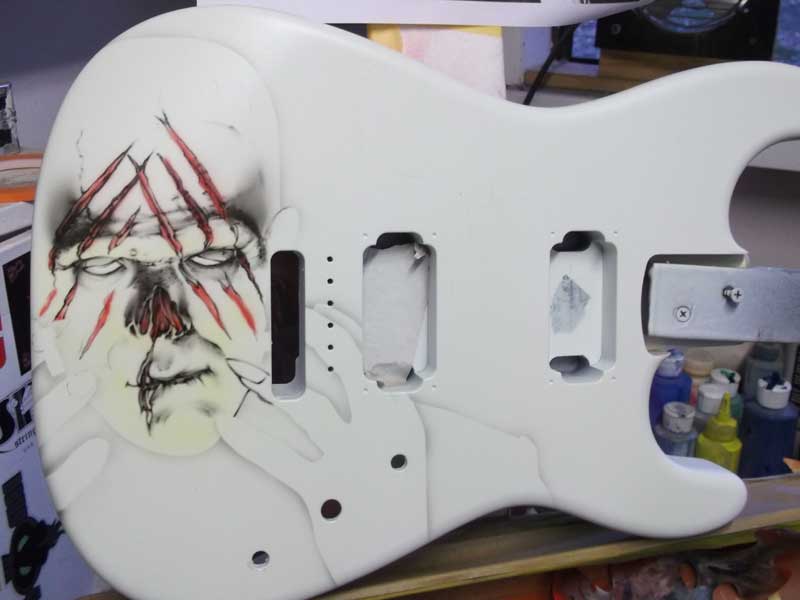
Run to the wood closed to see!
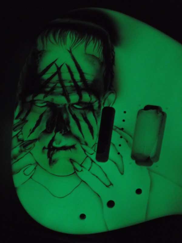
The GID does show through the yellow kandy, there is some translucence to the purple – but not the red.
A lot more work with details in the face, hair and the background.
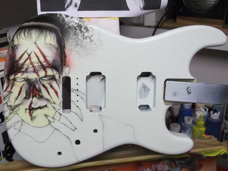
And…. back to the closet.
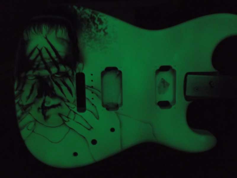
Working on the details and developing the image, it is really a challenge to keep in mind what has to remain untouched to keep my secondary (dark) image detailed. I use a bit of “scratching” in the hair to add highlights.
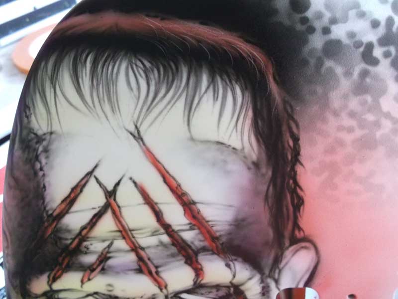
The background texture is a random splotchy thing that I created using a template I had cut for another project. I kinda like it. 🙂
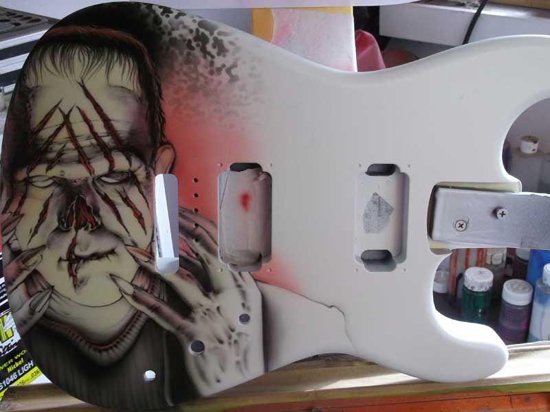
I am using some kandy purple for shadowing. The glow shows through the purple just slightly.
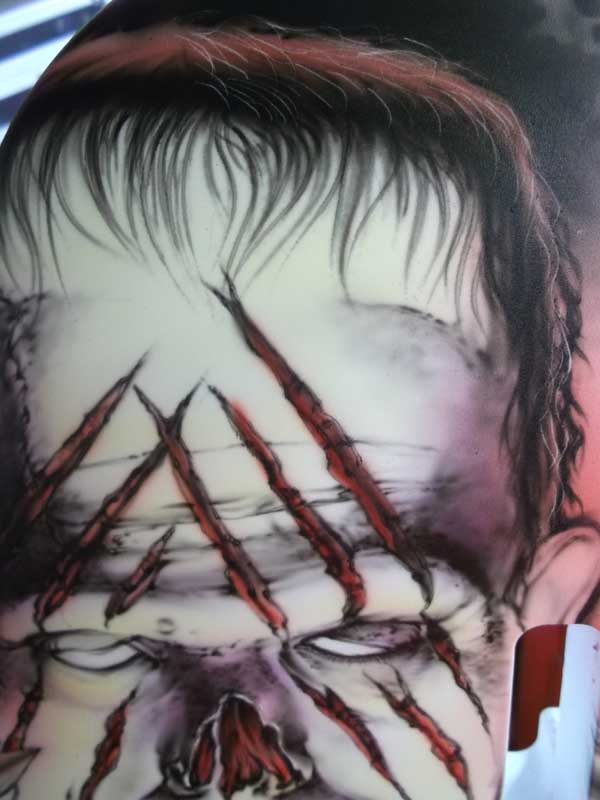
Time to start on the background imagery.
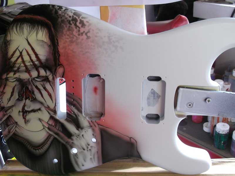
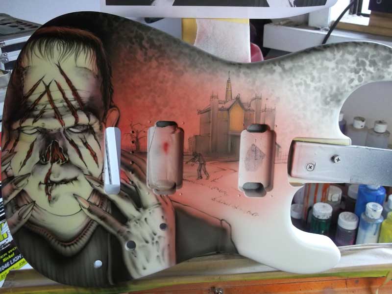
I decided to go with a castle and classic “scary” imagery.
I added in some cool Glow In the Dark effects with lightening and glowing windows.
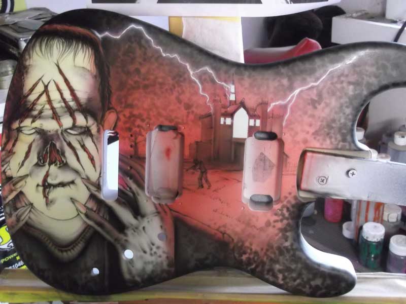
Here I added a layer in intercoat clear. I am going to come back in with a “Movie Title” and more GLOW after it cures.
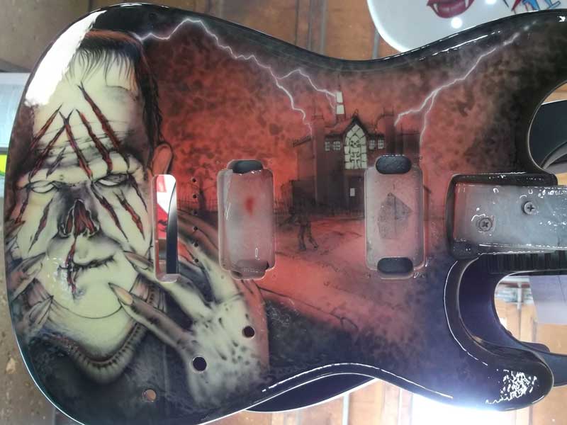
Here is the final image!! The lettering really makes it.
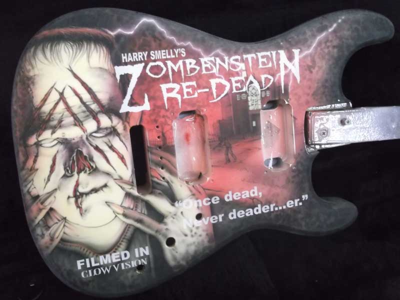
And…. in the dark!
