This painting was commissioned for Michael Lichter’s Speed Demon exhibit at the Journey Museum in Rapid City, SD. The painting only had to follow one rule, that it be inspired by Board Track Racing of the 40’s and 50’s. Piece itself is a 2′ x 3′ piece of steel.
I realize this is a sketchbook entry, but the sketch for this piece was so loose, that it would not be helpful at all to show. I really did not even follow the basic lines that the sketch shows. I got inspired for the composition of this piece and went straight to work on the canvas without working it out on paper like I do very often. I still feel the discussion of this piece is valuable even without the sketch.
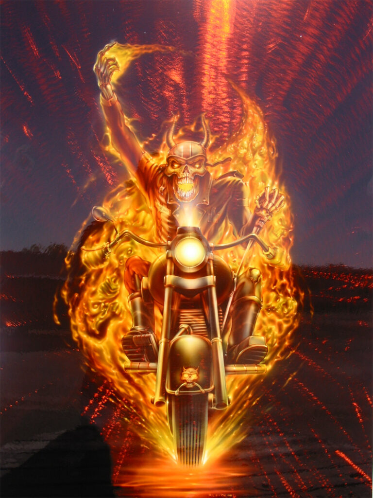
Design: For this project, my goal was to capture the essence of instinctual racing habits with some form of visual metaphor. I wanted the feeling of racing being completely second nature to the racer to come across to those looking at the painting. To start off the mural, I wanted to capture the feeling of things really rushing by you. . . A sense of speed. To accomplish this I began by grinding the steel in a pattern that creates a sense of perspective with the diminishing point directly behind the main character.
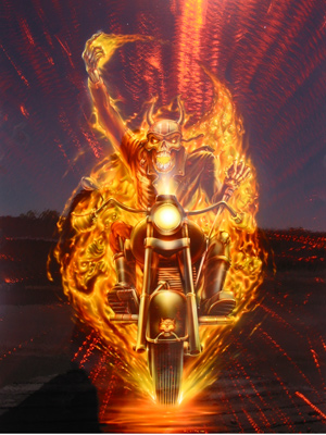
Composition: The main composition rule for Speed Demons is the Figure 8. This is a very powerful composition type. The Figure 8 here creates a magical and cosmic “guidance system” that releases from the character’s right hand, flings in to the background, but comes back around and emerges again in the foreground. Take the time to really see how this composition works and it keeps you glued to the subject. I rely on this composition mode to really put the “subconscious racing” idea across. Look closely and see that the character’s hands are not on the bars at all, the bike is being guided by the system of little gremlins and “speed demons.”
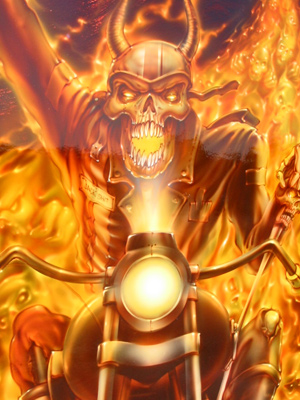
Another important part of this piece is the intense light source from the headlight that not only illuminates our main subject, but pushes forward and shoots the bike forward out of the flat metal. This effect is further solidified by the sparks coming from the tires with give the feeling of tension between the background and the main focal point. It shows solid contact between the ground and the bike.</p> <p>You may notice also that the attire of the character – the leather helmet and one piece leather suit – further establish the vintage feel. Also note that the helmet is not strapped, giving a sense of confidence. He is definitely enjoying the ride. Throughout the painting you can see much of the grinded metal showing through. It really gives the painting a unique look as you view it from different angles.
Application: The steel panel was ground down with a disk grinder then kandied with SEM Root Beer Kandy. After that we smoothed it out with 800 grit and I went to work with the art. The colors used were white, SEM Kandy Sunrise and Kandy Mandarin. The detail was done with a mixture of transparent red and green. There is very little use of any other color. When it was complete, we cleared and buffed and it now sits in a beautiful frame with variegated gold leaf accents.
Notes from Diana: This piece simply cannot be fully appreciated in photographs. I have tried photographing it in the daytime, night time, in the sun, in the shade, in the booth, on the wall, at an angle – with flash, without, I have used all my tricks and I simply cannot get the depth and intensity of it to show up in pictures. Those of you who have seen it on our wall at home have a better understanding of how powerful a piece this is. It is truly one of my absolute favorite pieces of art Mike has ever created.
Additionally, I LOVE this Series that we are doing. I always love hearing the stories behind the things that mike paints. I find it fascinating and it really helps me enjoy the art even more. I suppose we could call this a course in Art Appreciation. 🙂