I have been working with the Jackson Custom shop since 2003. The projects they send me are generally a lot of fun because the Jackson guys really allow me full creative control. As a life long guitar player and enthusiast myself, I am very familiar with Jackson’s branding and I am able to work within those parameters to create some really bold and well-received pieces.
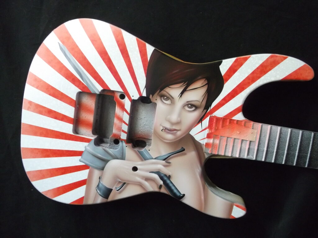
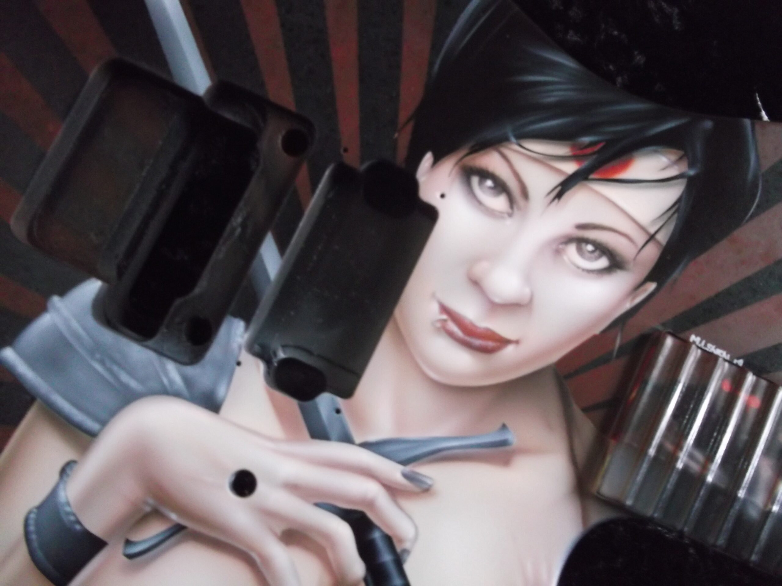
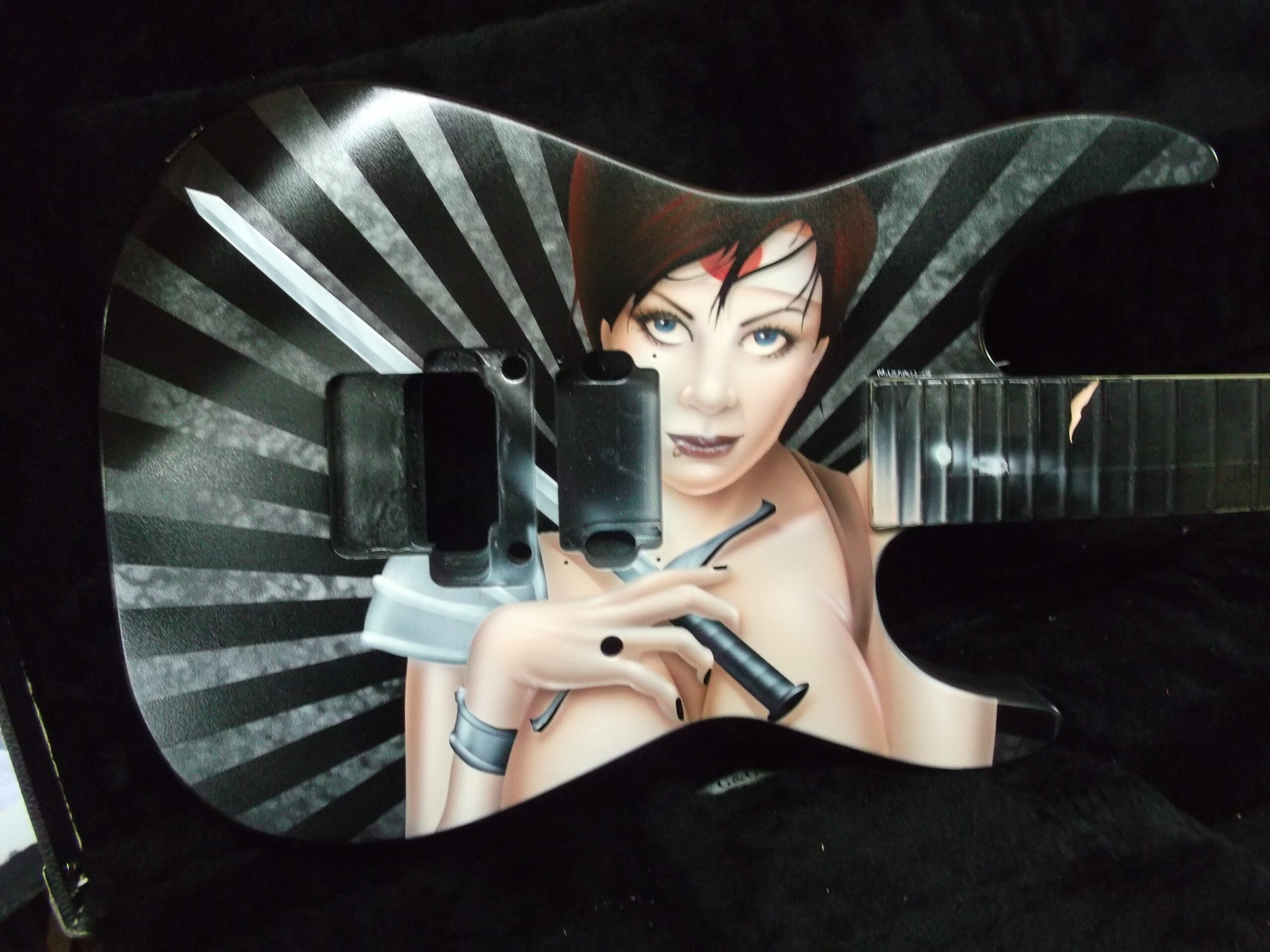
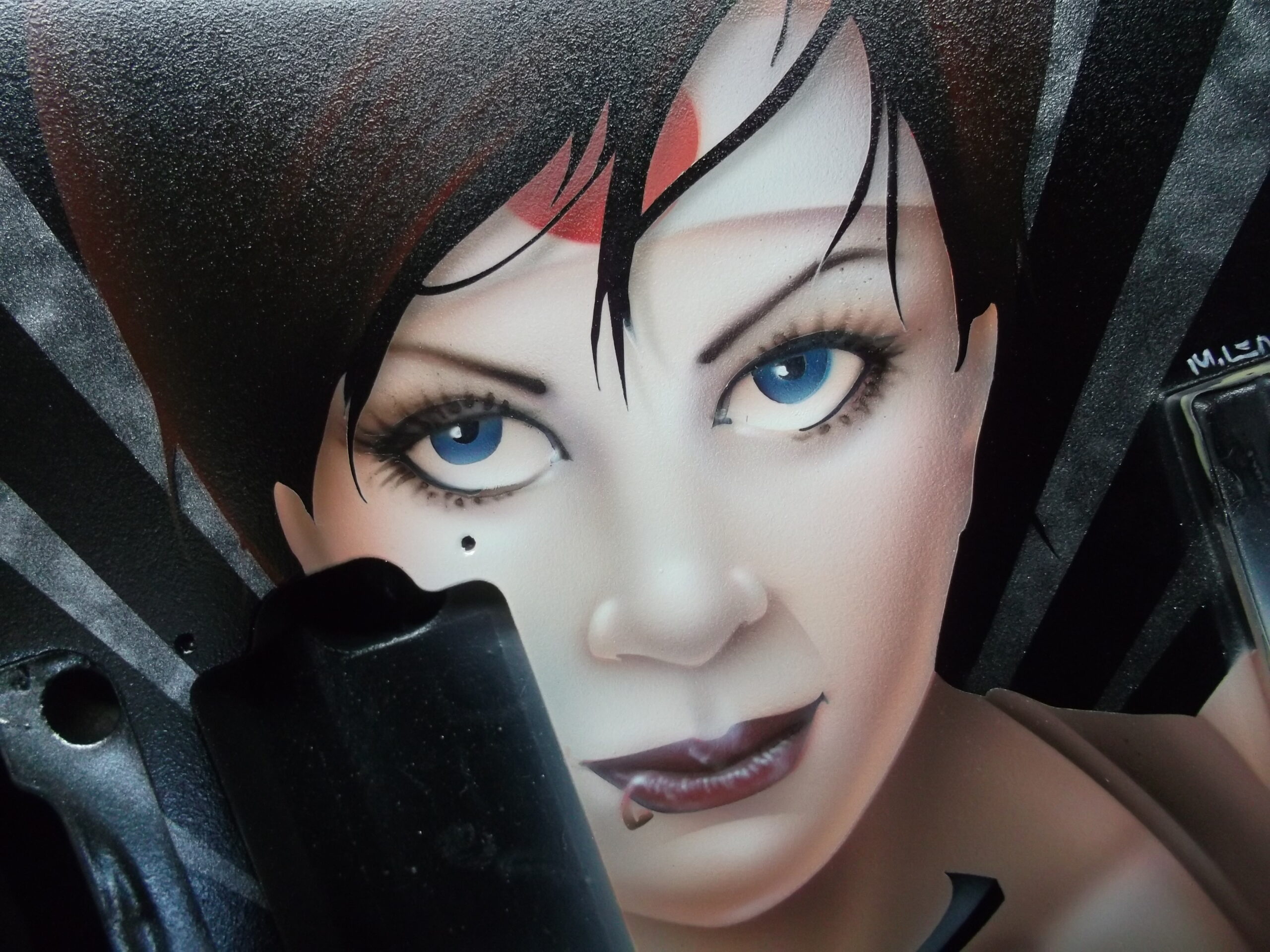
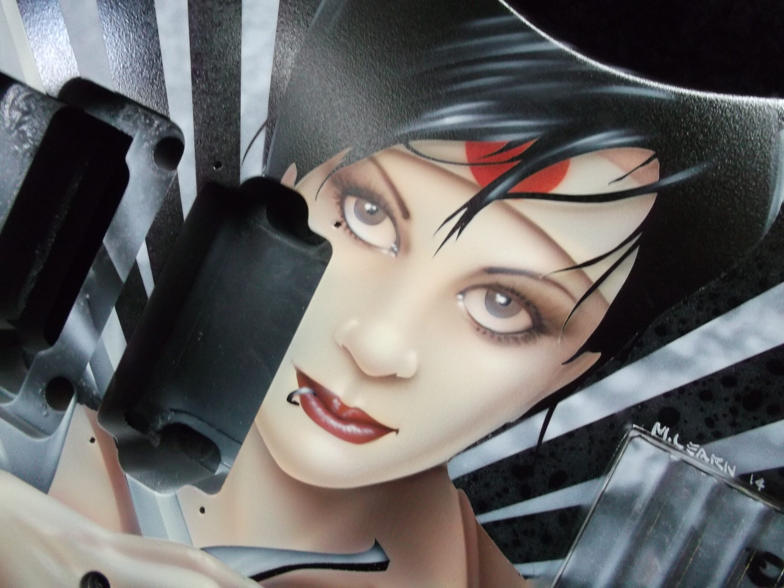
This particular run of Jackson Soloists was ordered by Guitar Center for some of their “higher end” outlets. They were looking for a series of “anime-styled Suicide Girl Samurai warriors”. As I was in the creative development phase, I really thought that it would be neat to sort of pay tribute to the Nagel guitars that were so popular in the 80’s. I wanted to give the girls a more “metal” edge, but still stay true to the classic graphic elements with some bold vector work
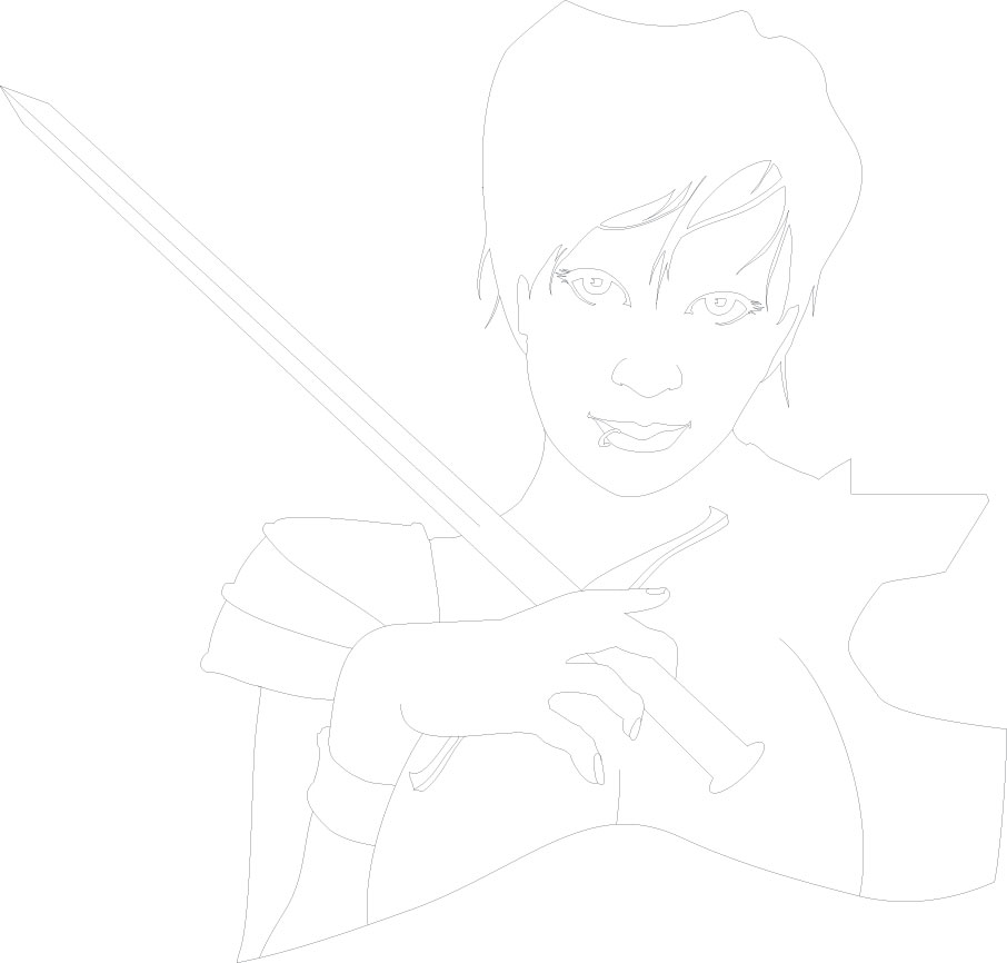
I began my reference work with an image from a web search, but I had to do quite a bit of photo manipulation to get the right “look”. To work in the anime style, I enlarged the eyes and thinned out her chin and nose to more of the triangle anime shape. From there, I used CorelDraw to set up the series of masks that I would need. I started with a mask for the girl. I used bold masking for the hair, drew in the main features (eyes, nose, lips, eyebrows, etc), along with the hands and her sword. I also created an outline of the girl and then another file was drawn for the vector elements of the background.
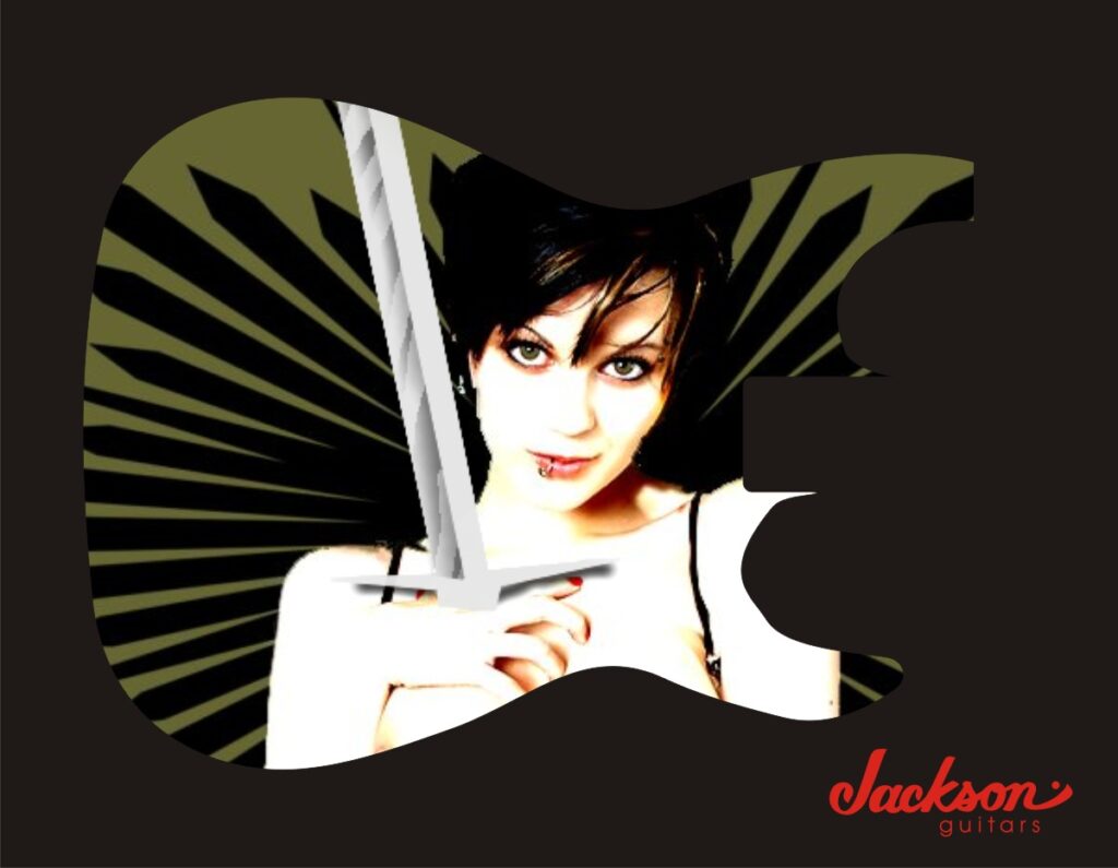
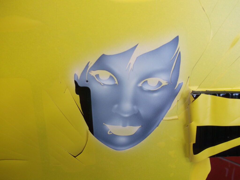
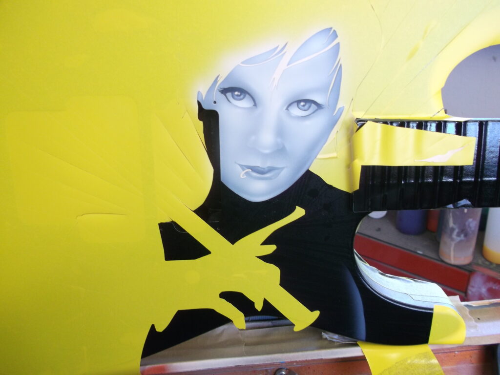
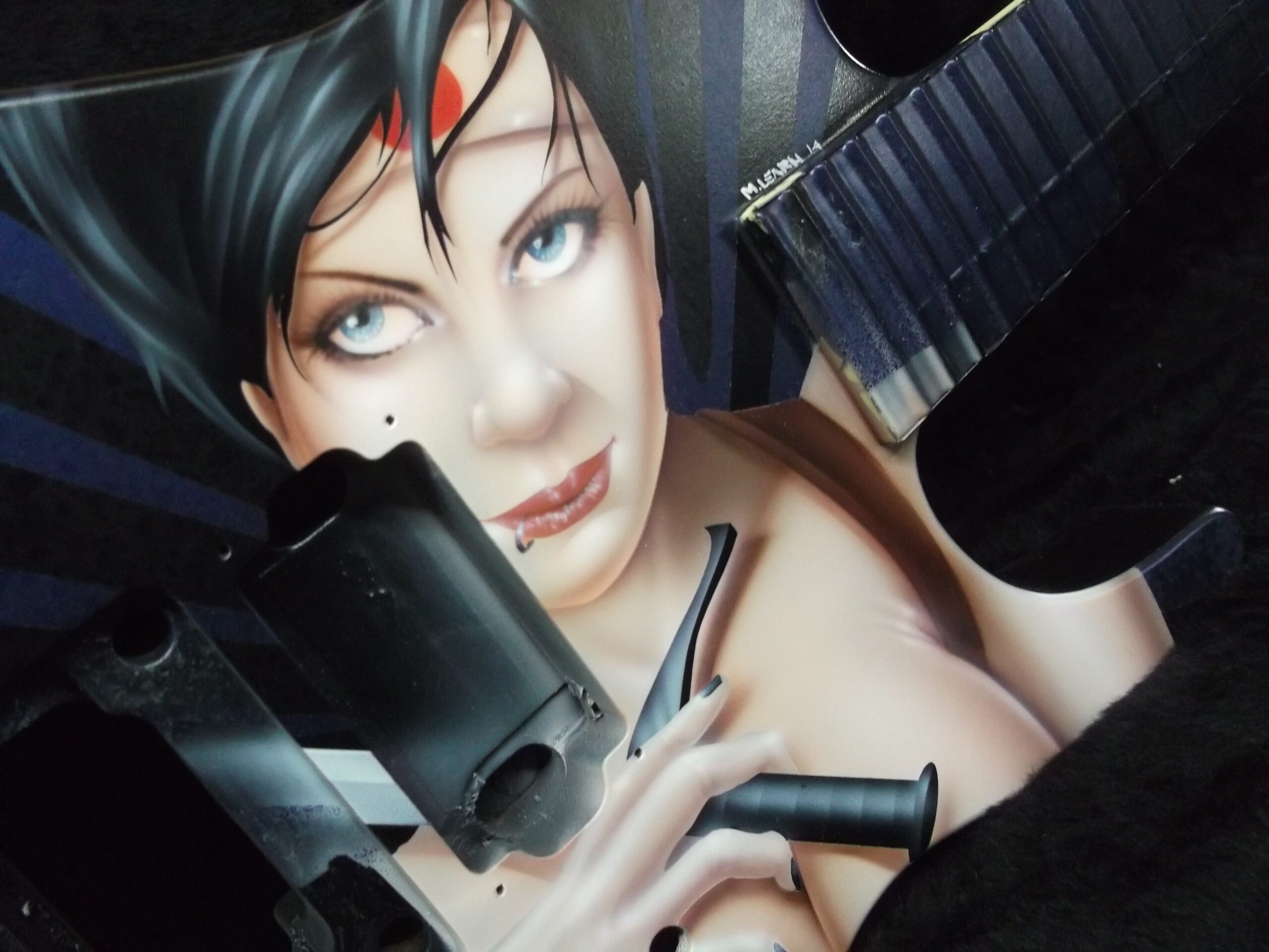
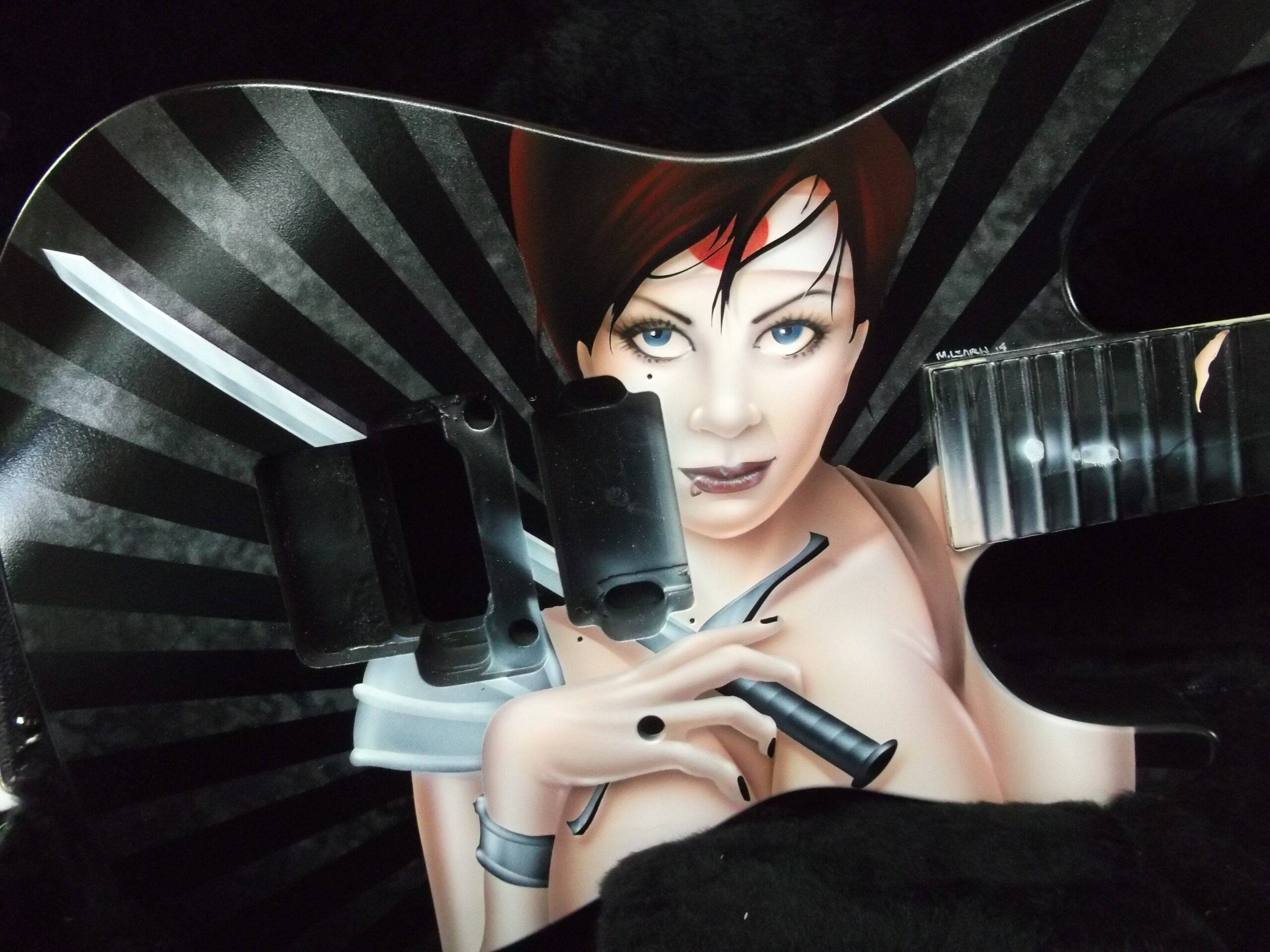
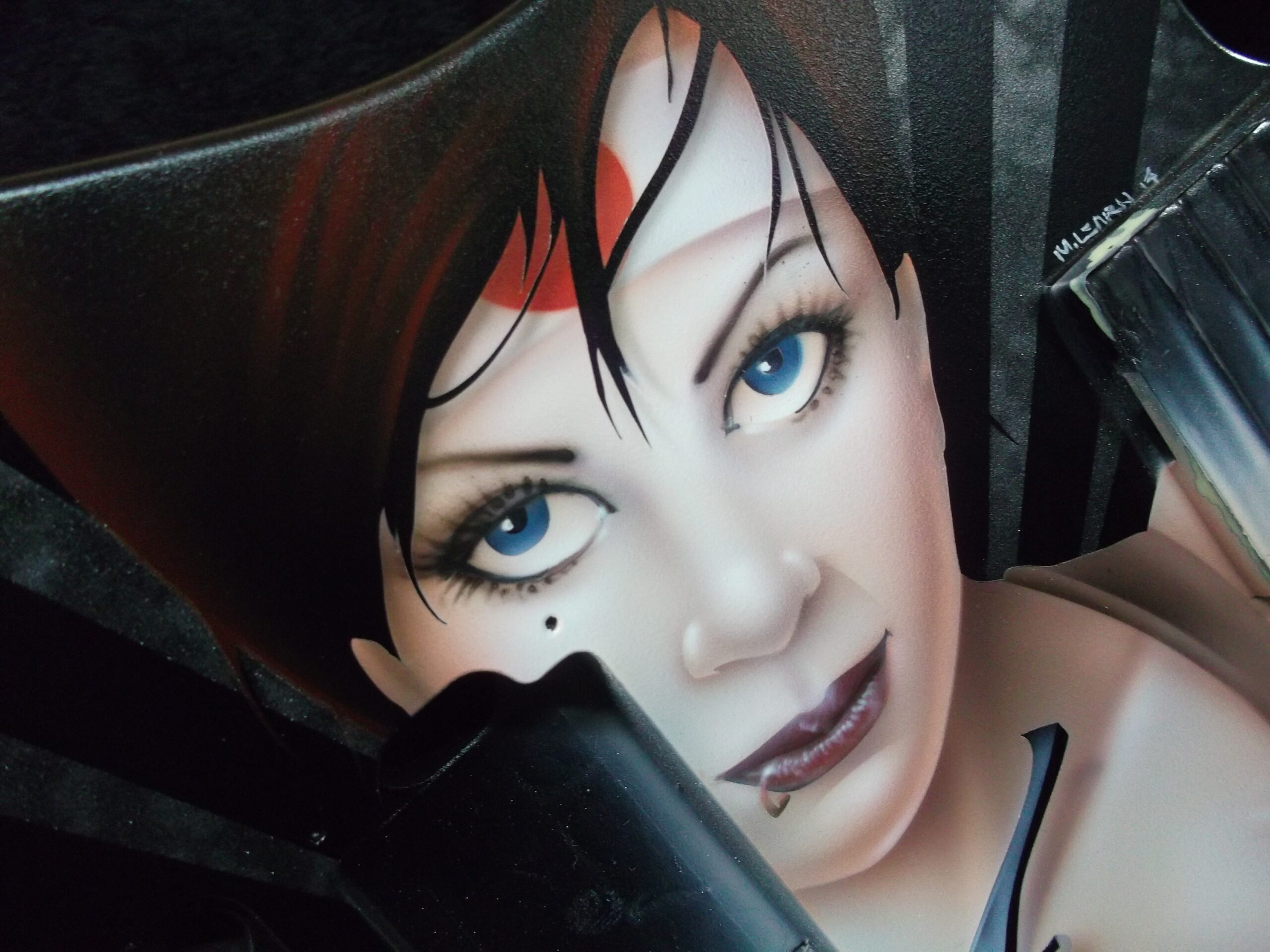
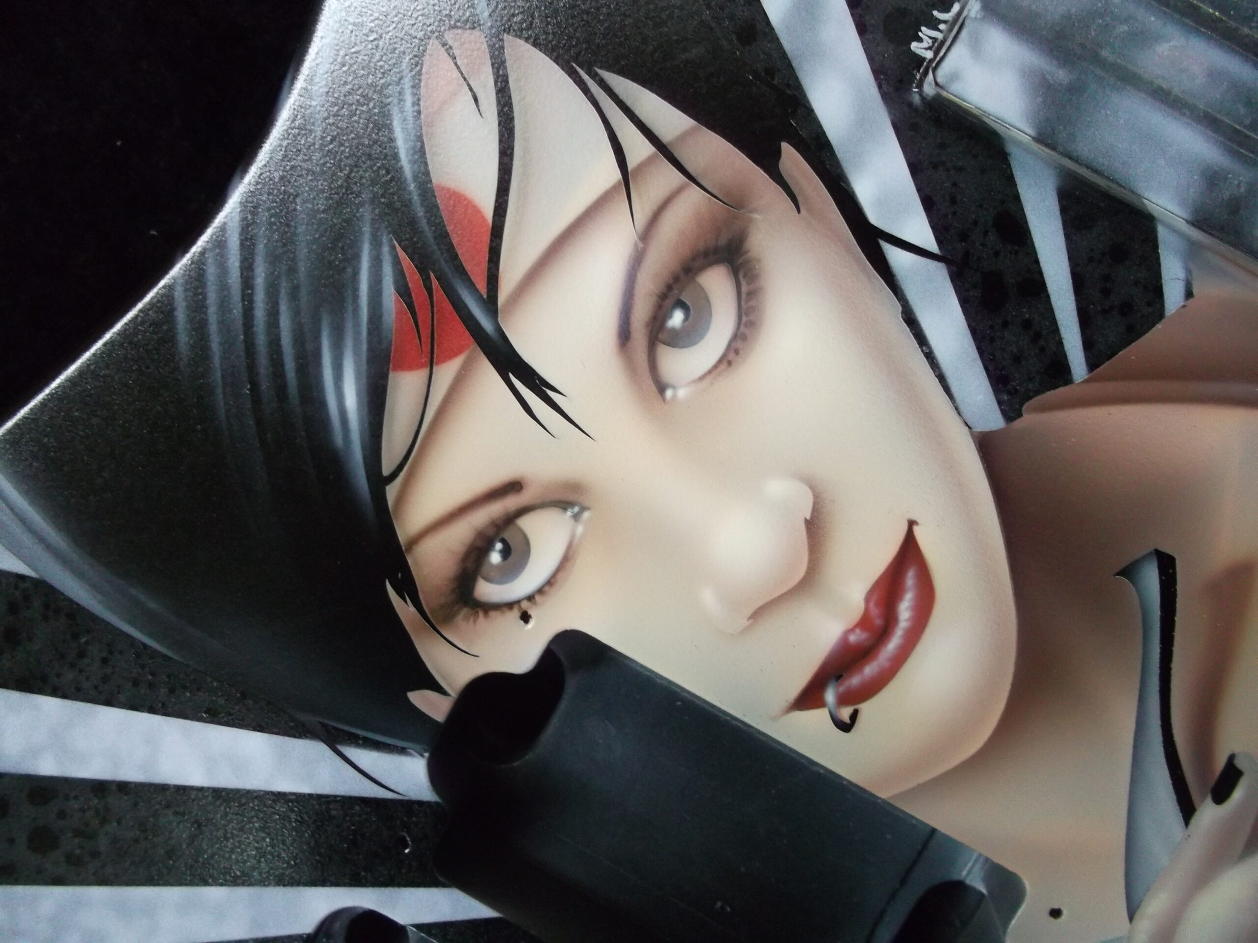
While I am doing a series of six guitars, the idea was to have each one just a little bit different. This allowed customers to have one of a series, but still have a unique piece. To achieve this, I pretty much stuck to the same flesh tones and facial features for the girls, but I mixed it up a bit on backgrounds and color combinations. Throughout this article, you will see shots from all six!
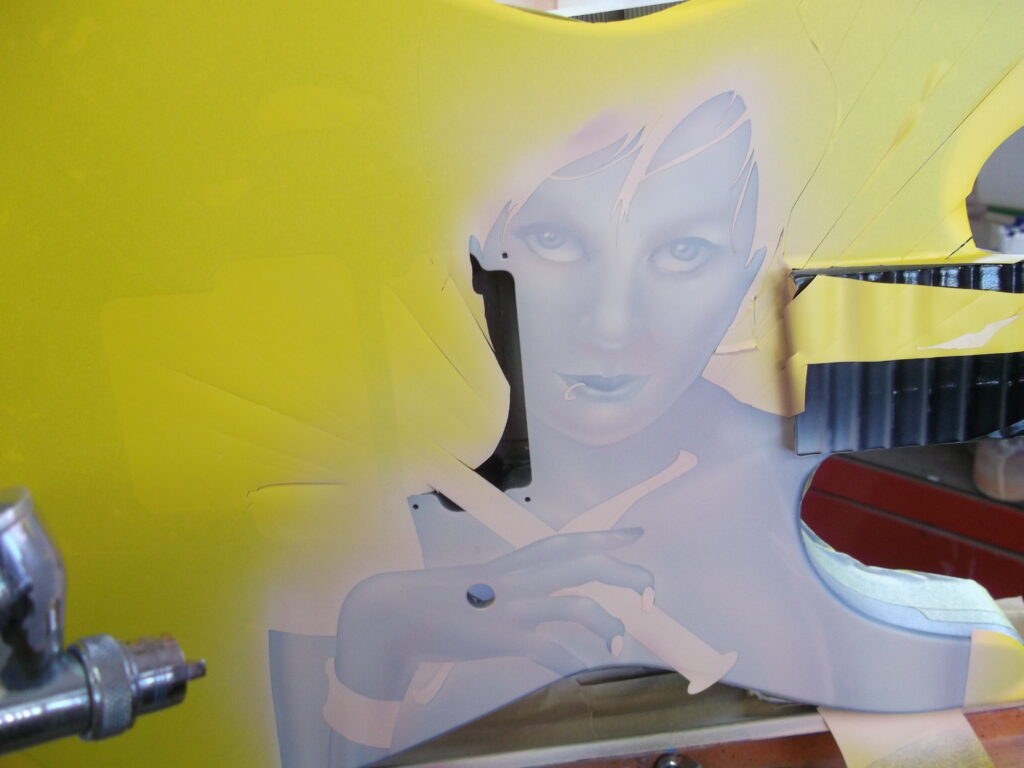
Let’s start by taking a look at the lines on the vinyl mask that is set up for the girl. Here you can see that I drew just the main features. Your mask should not be overly detailed and you certainly should not spend inordinate amounts of time drawing this part of the project. Think of the mask as a mapping system – a way to ensure that main features are in their proper place and in their proper proportion. This is especially important when painting the human figure. Nothing will turn your sexy lady into a monster faster than unnatural placement of main features or improper sizing or proportion!
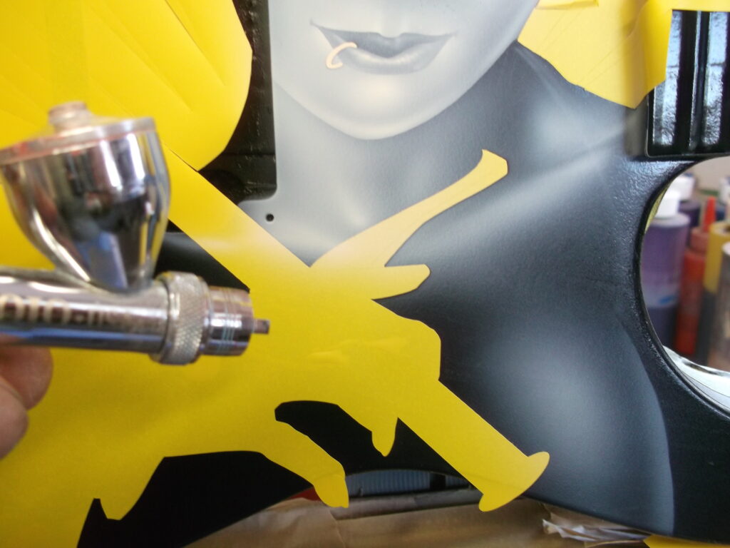
Next I cut the masks, weed them where needed and apply the transfer paper. I use Avery paint mask almost exclusively. In my experience this product has the best performance with the least amount of fuss. With all the prep work done, I am ready to get started on this job!
Starting with a clean, degreased surface, I peel the vinyl backing from the mask, position it on the surface and use a squeegee to press the vinyl firmly to the surface while removing air bubbles. I pull the transfer tape off and grab an airbrush.
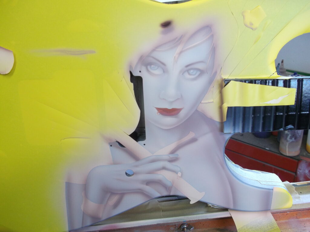
I almost always paint using a method known as grisaille – establishing the entire design in values of gray as an underpainting before any color is added. Not only does this method allow me to work out the entire piece without the clutter of color, but it saves A LOT of time in the color phase, because I can really just use color washes, and avoid excessive mixing and struggling with multiple shades.
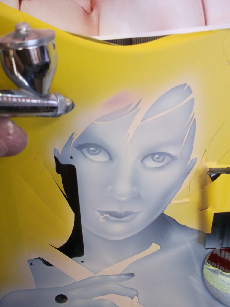
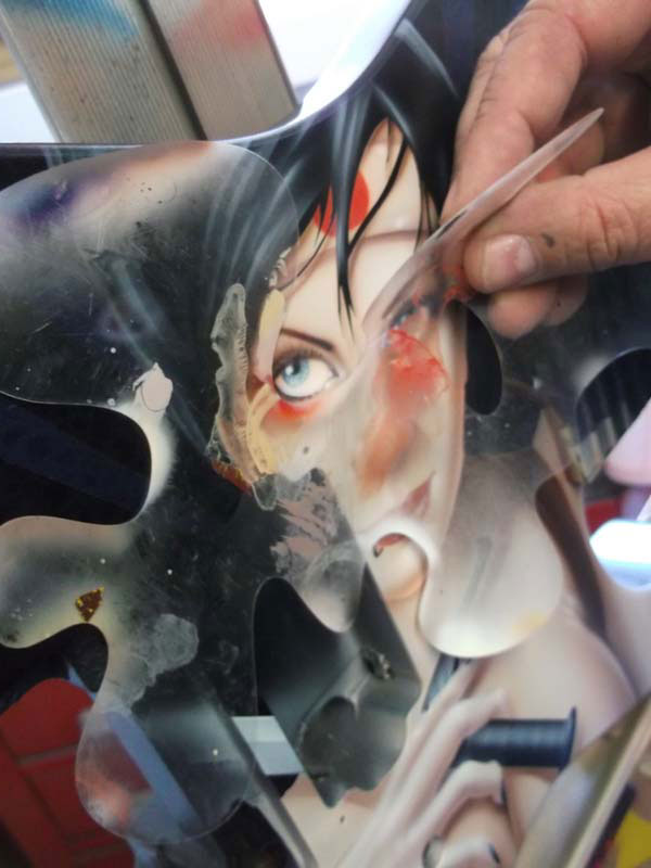
With a very well-reduced white in my brush, I begin by lifting the attached nose “flap” of the mask and quickly establish the lines with a few strokes of the brush. From there I remove the main face section of the mask and begin building the features. Referring often to the reference image and always keeping in mind my light sources, I slowly develop each area. I will use values of white from barely there to nearly 100%.
Notice that I keep the eyes and lip masks in place. I want these areas to be the darkest and I also want sharper lines of contrast. Softer transitions, like the nose and eyebrow area are created with soft strokes, building the highest points in layers.
When I am generally finished with the facial features, I pull the inner eye mask revealing the iris. Small, precise strokes create the texture of what will be the eye color. Now the rest of the facial masks, with the exception of the lip ring, are removed. I give a light wash over the eye area, just so that it is not such a stark black transition, and render the lips.
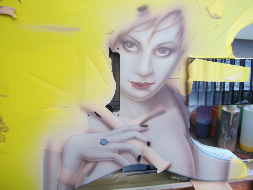
Moving on to the chest area, I pull the mask and switch to a fan tip to allow for a broader, smoother application of the white.
Since the area is rather large, switching to a wider spray allows me to build the underpainting with smoother transitions and more efficiently.
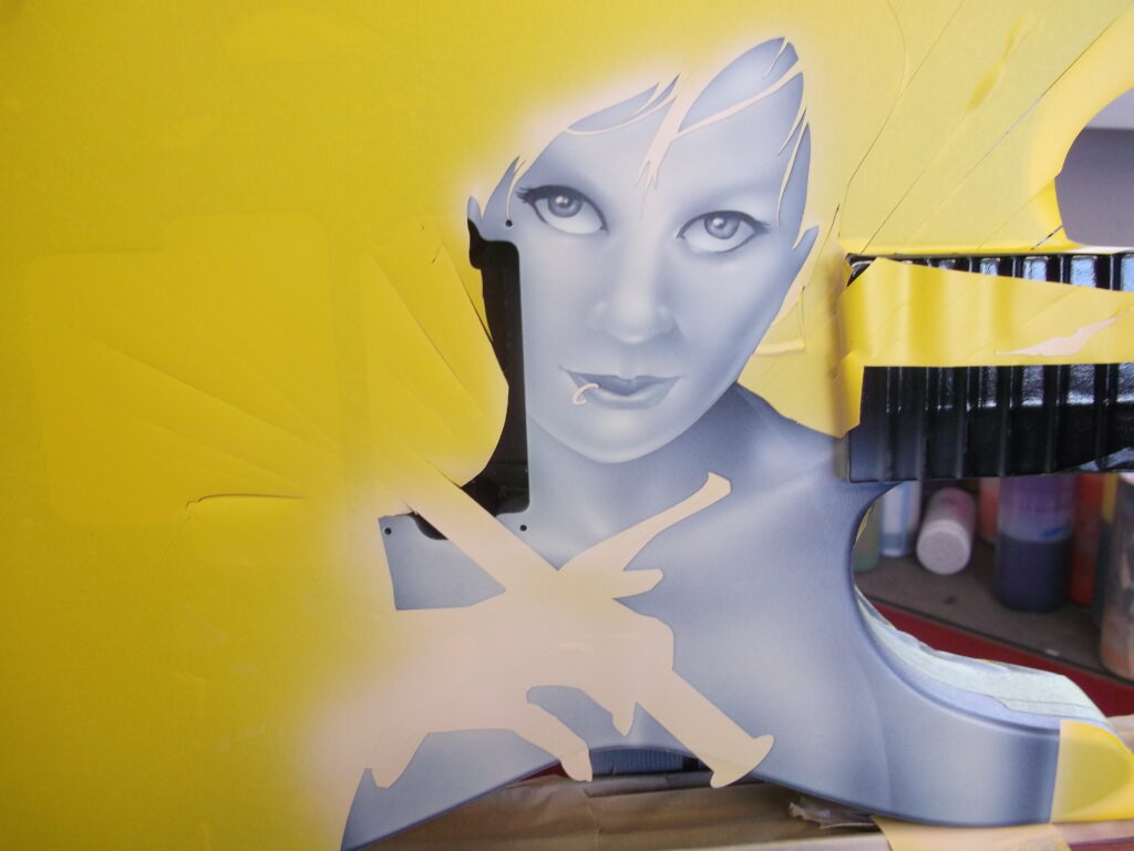
Switching back to my precision tip, I unmask the hand. With my reference image as a guide, I build up the shapes and details of the fingers and wrist. Since the hand is the foremost part of the mural, its rendering will be more saturated than the chest. I also utilize shadowing to set this feature apart from the background. Notice that the edges of the hand against the chest are not hard, rendered lines, but rather they are created by the lack of application of paint. The same method is utilized around the chin.
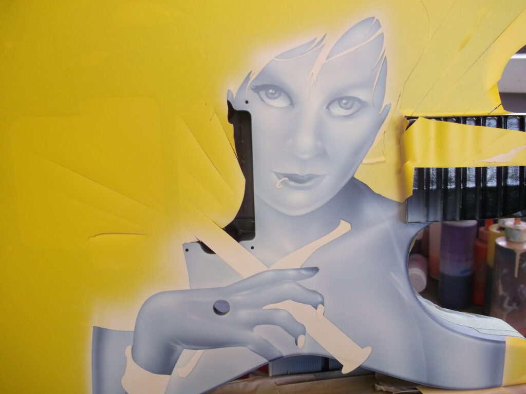
At this point, I am done with the underpainting. I step back and make any final adjustments needed in the shaping and contrast. The entire piece should be fully developed before the first spray of color is made.
It is important to take a break from your artwork periodically. Also, look at it from different angles and in different light while you are still in the development phase, so that you can identify and address any potential problems before you get into color. Early correction is infinitely easier than trying to work out a problem when the mural is essentially done.
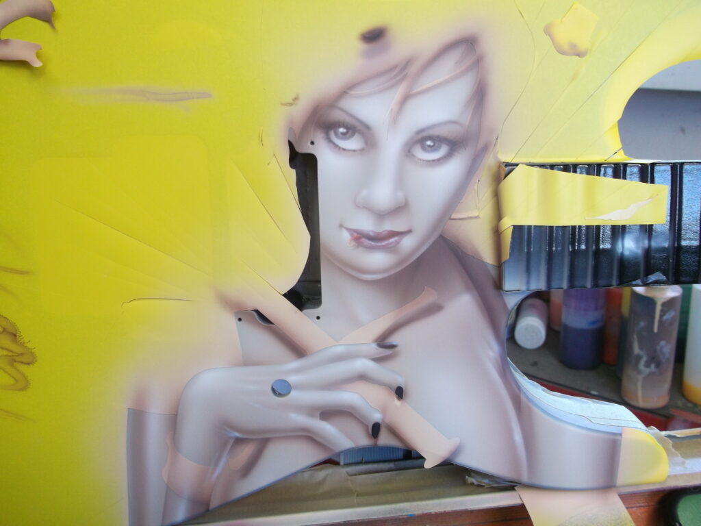
I mixed a flesh tone using primarily white and orange with a drop of red, and then just the smallest dash of green – just to knock back the tone ever so slightly. I am painting with urethanes and the colors are made from transparent base coats, both Spies Hecker and Matrix.
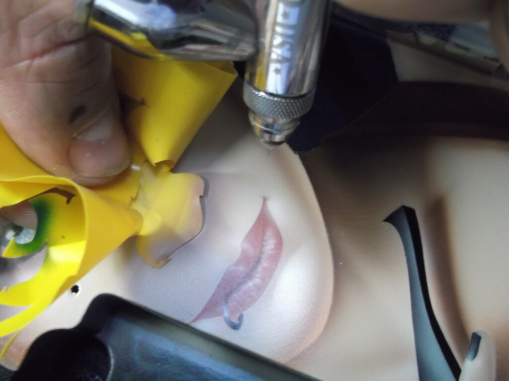
I begin the coloring process with a very light color wash of the skin tone. Because the underpainting defines everything, this step is quick and easy.
I gave the lips a quick wash of trans red before moving on to work with the flesh detail color. The mix is approximately 1:1 trans red and trans green, with a little black to deepen the tone. Notice that I generally keep a test spray on the mask. This allows me to make sure my colors are working well together and gives me a place to color match later, should I need to.
I start the darker color work with broad, smooth strokes in the shadow areas. These areas are already defined by the least application of the white underpainting. I am not adding anything new to the painting, simply defining. Notice the use of the darker shade to help define the hairline and bring fullness to the shapes.
Now I move on to the more precise application of the detail color. This part of the process is when I really “carve out” the details. Again, simply following the map laid out in the white, I work to define features like the eyes, lips, nose, the creases of skin, eye brows, etc. The color should be built up gradually and smoothly.
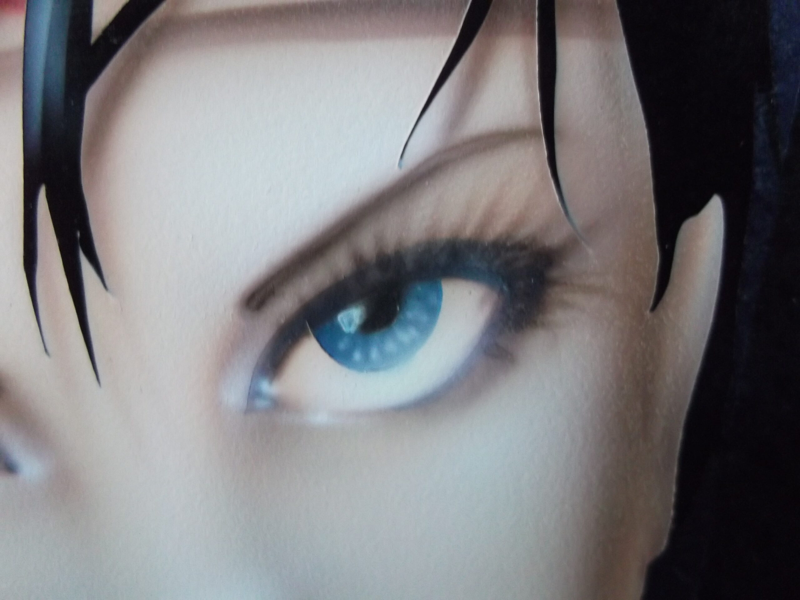
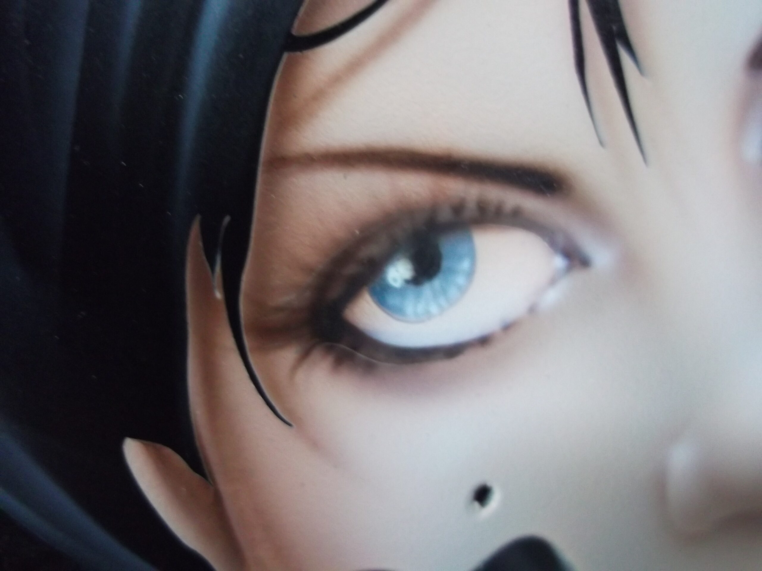
The final step is to go back through the painting and add final, white highlights. With careful consideration to my light source, and as always, following the underpainting, I strategically add highlights to emphasize shape and reflection. The “twinkle” in her eye, a bit of wetness along the eyelid, a gloss to the lips and a healthy glow on her skin, these small details bring the painting to life.
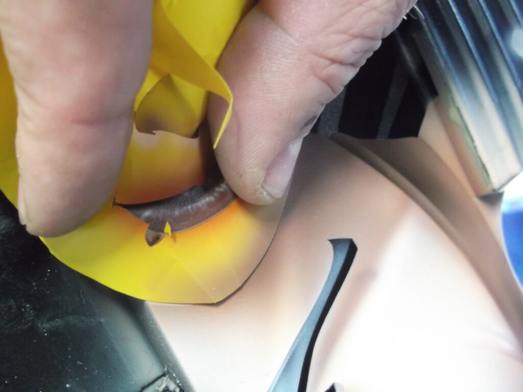
NOTE: Notice that I save all my masking pieces as I pull them from the painting. They come in handy as I move through the process. I can use them again to define a line, as a loose hand shield or to protect an area from a wash. This is one of the GREAT advantages in using a vinyl masking system. Another advantage is that there is absolutely NO cutting on the surface, so you do not have to worry about cut lines showing up in the clear booth!
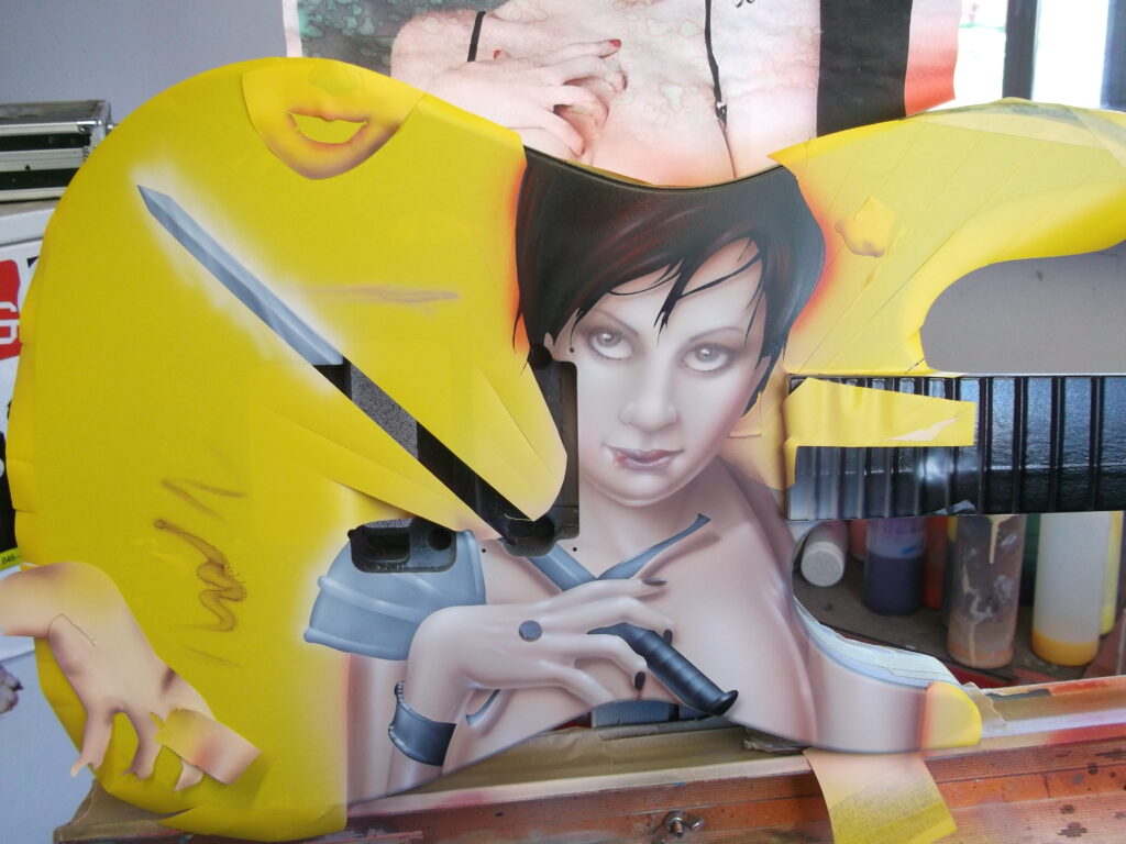
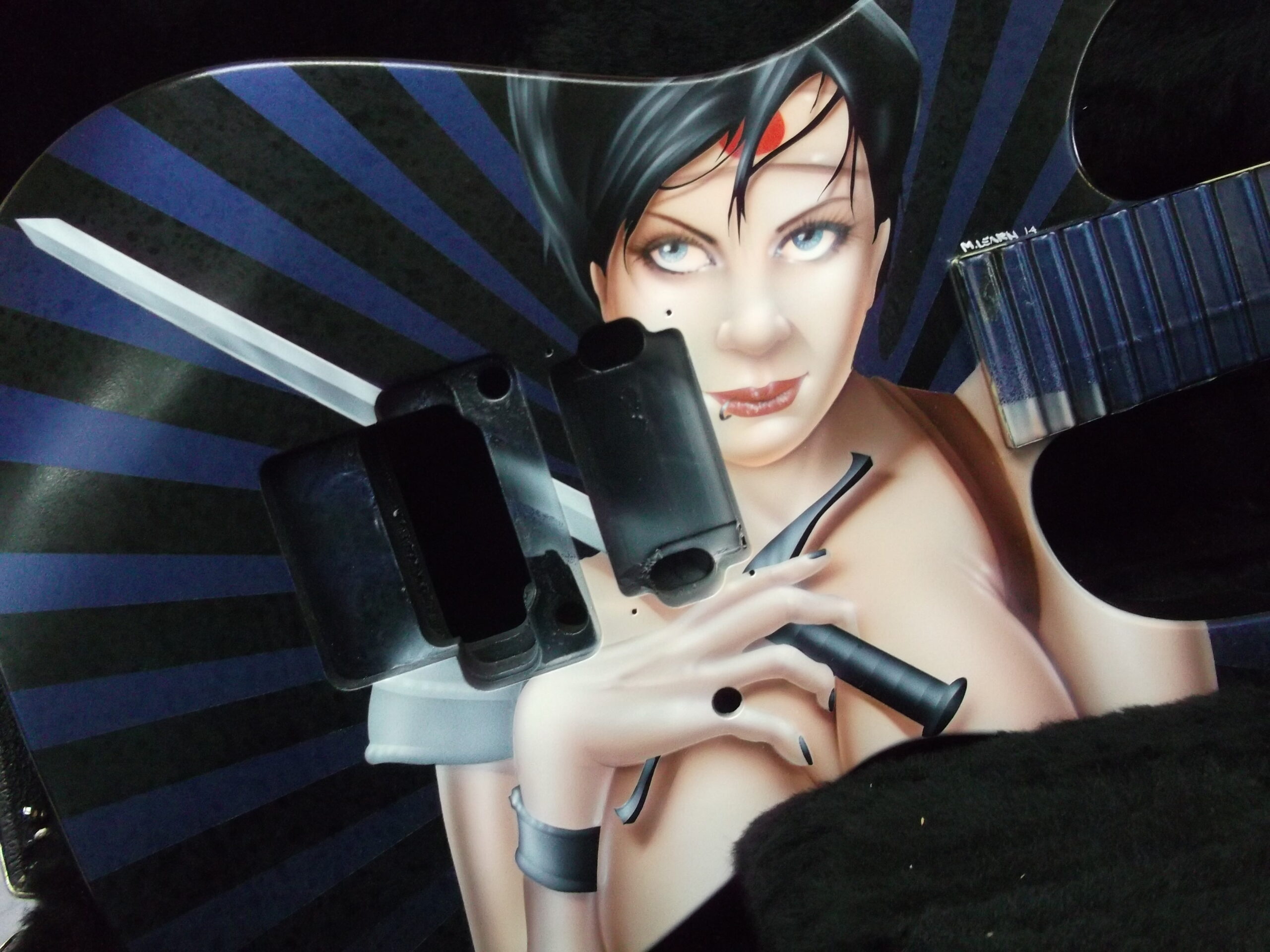
It is time to unmask and finish up her hair and “accoutrements”. The metal bands and the sword provide an opportunity to use texture to define the image. The reflective objects are rendered with much sharper lines and the use of strong core shadowing.
Keeping in mind that the girl is to have an anime appearance, the hair was highlighted in bold strokes, using both white and some trans red for color, shine and interest.
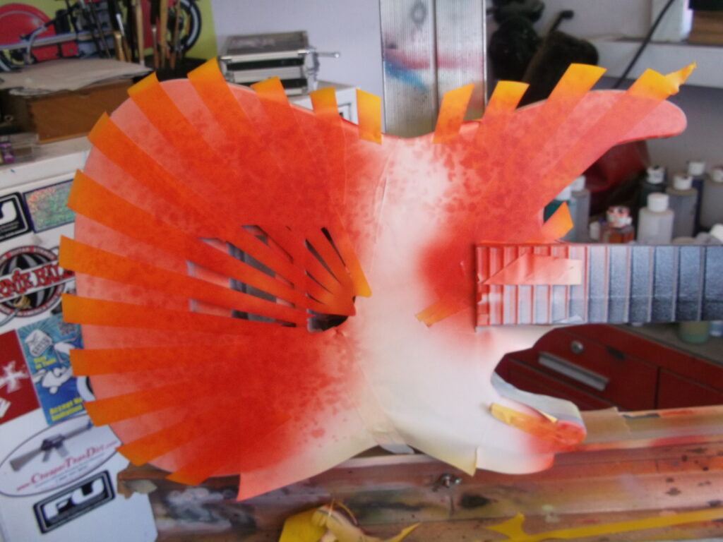
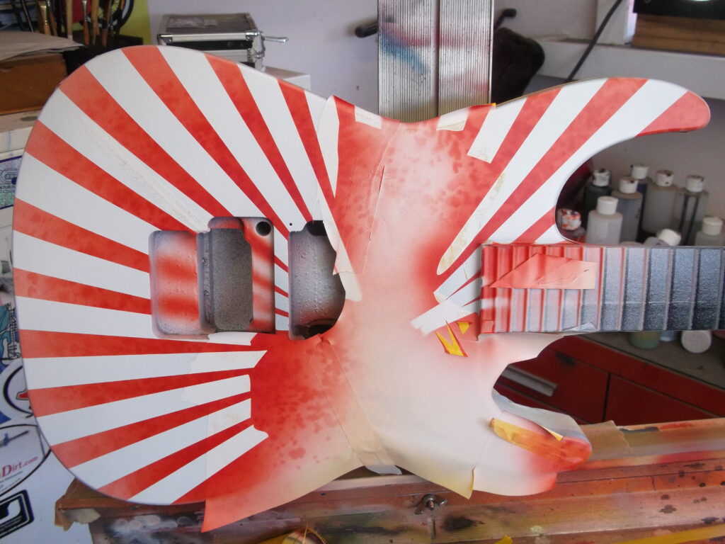
With the focal point of the piece pretty much completed, it is time to move on to the background. I use the outline mask that I created to cover the entire samurai mural. For this guitar, I then sprayed the entire background white and re-applied a new set of graphic masks. For some of the others, I worked with the black.
I then used a trans red and a distressed pattern loose hand shield to create the mottled texture.
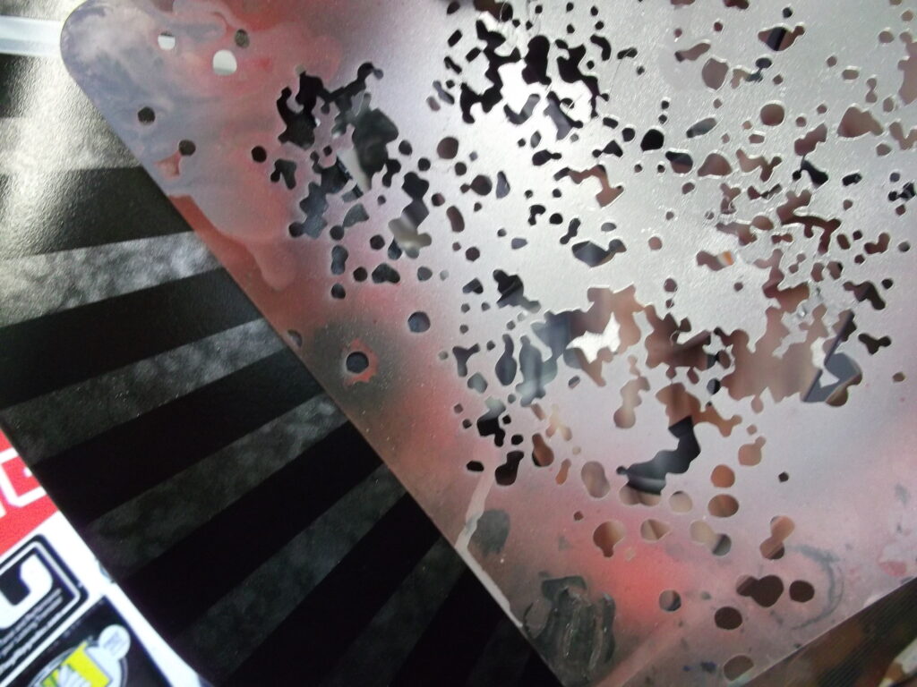
To further add interest and texture to the background, I removed all the masking and decided to do a water drop effect.
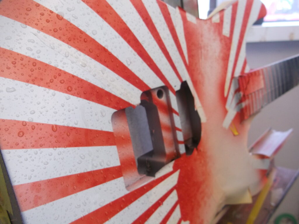
Using on of my FBS sprayers, I covered the surface with water drops.
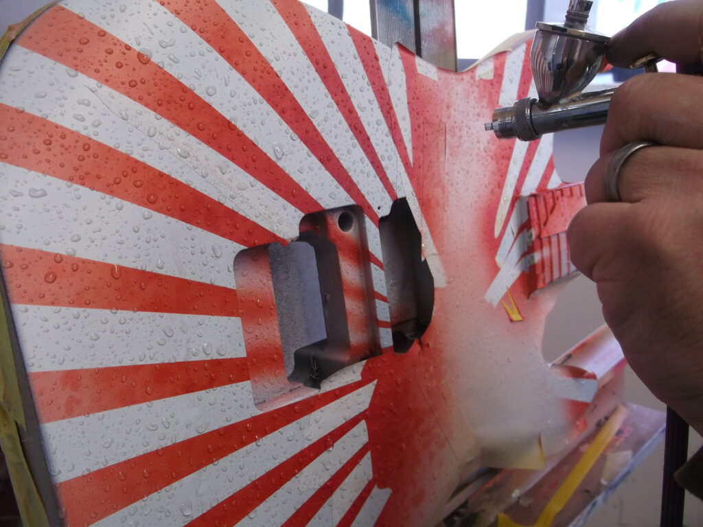
With my fan tip I then lightly covered the exposed surface with my brownish color.
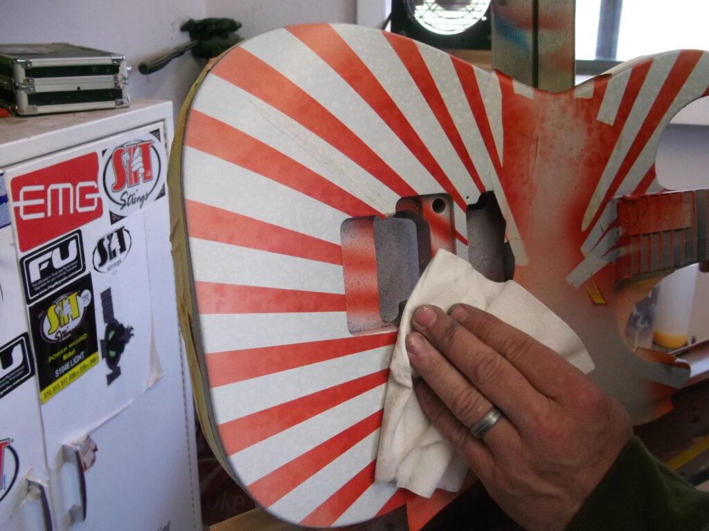
After giving the paint just a minute to adhere to the dry surface, I wipe the entire thing down with a clean, lint-free cloth.
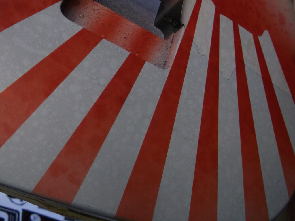
Pretty neat and easy effect!
Now the big reveal! I unmask everything, give it a last “once over” making sure everything is as it should be, and this one is ready to head back to the Custom Shop for clear and buff!!
EXTRA!! EXTRA!! Tips and Tricks of the Trade!
I have several sizes of a general “curves” loose hand shield that I use as I work through just about any mural. These shields come in handy both to cover an area you do not want to hit with overspray, and to allow for a nigh straight and sharp edge when needed. The variety of arcs and curves on the shield allow me to find the perfect shape for any application. I cut these on my plotter in a series of sizes.
Carefully saving the pieces from the vinyl mask comes in very handy as I work through murals. I re-use them often to define shapes and shadows and avoid overspray!
This loose hand shield was cut on my plotter and is so useful, that it is always on the bench. For this piece I used it to add the mottled texture in the color of the background graphic. I made it from a random splatter brush I created in CorelDraw.
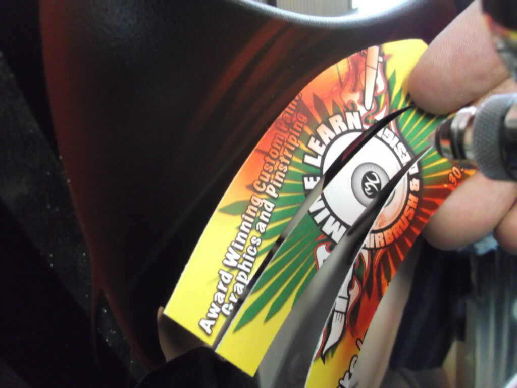
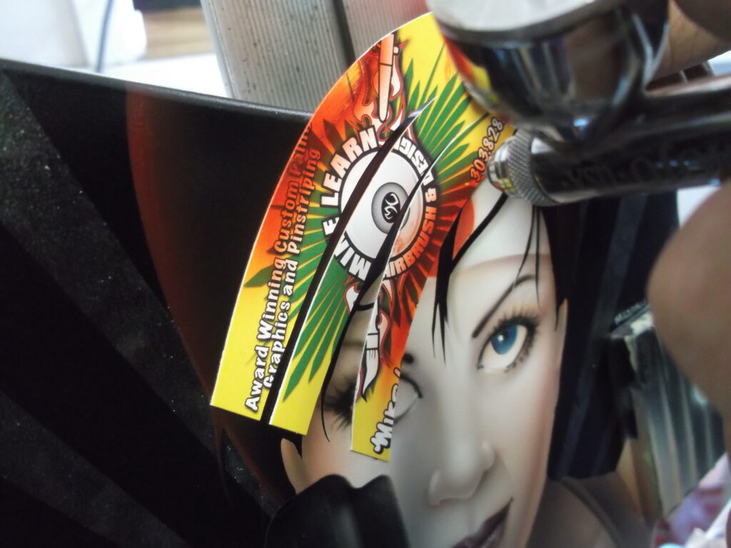
Business cards are not just for marketing! The card stock that most business cards are made from is the perfect rigidity for loose hand shielding. Using a sharp razor blade, I often cut cards to be used for very specific shielding needs. In this case, I used the curves to define the bold layers in the anime hair.
THE FINAL WORDS
The nice thing about doing a run of similar projects like this, is that you get all the time consuming things out of the way on the first piece. Once the masks are perfected, the colors are mixed and all the shielding made, the subsequent pieces really flow easily. These types of jobs prove to be more profitable than most – even when providing a nice discount on multiple pieces.
And – Here is a set of shots from the completed series (none of these have final clear because Jackson does the final finish on their pieces):


