The Tattoo You Stencil from Mike Learn’s Air Essentials is crammed full of tattoo style artwork that can be used in dozens of layouts. Take a close look at all the different templates that are wrapped up into this one handheld stencil. We will most likely do multiple tutorials on this particular stencil. For the first one I am doing a somewhat simple design utilizing the beveled Maltese cross and mixing in some real blue fire.
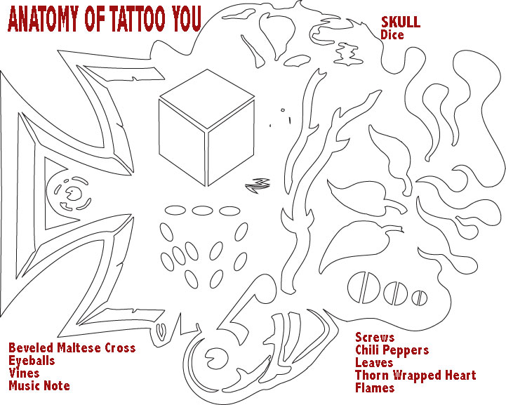
Do you see all the items?
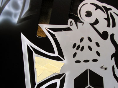
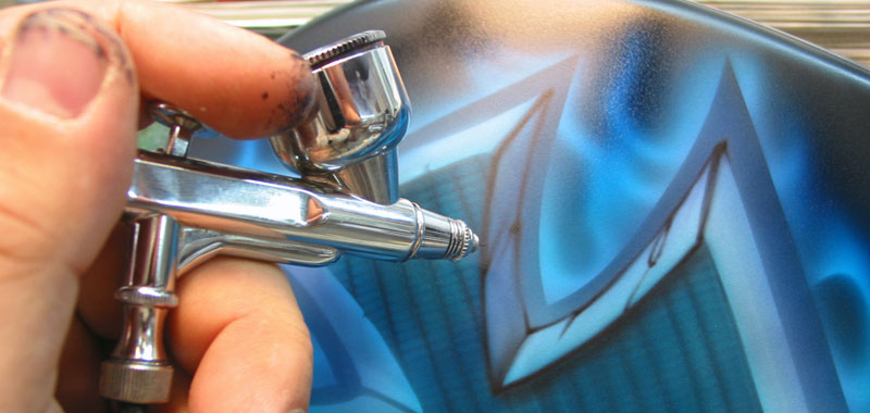
1. For this project I jump right in with the half cross. I have taped up the eyeball portion since I wont be using it on this project.
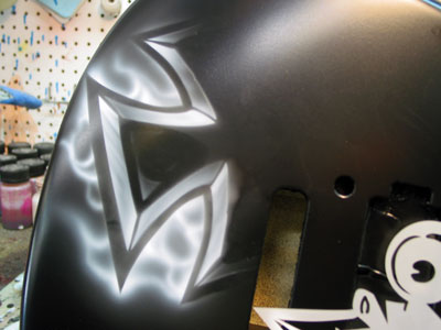
2. I start with my usual well reduced white. Rather than just blasting white down through the stencil, I am working the area within the bevel giving it a brushed metal type texture, while starting some freehand flames on the outside of the cross. Remember that the whole idea of using template systems is to execute the project so that it DOES NOT look like stencils were used. Working the area within the template with shape and volume will help you achieve this.
3. Once the left side of the cross is complete, I simply flipped the template over, matched up the center and repeated the same process on the right. My goal was to give the cross a vintage feel, so I used the irregularities in the edges to work with the design.
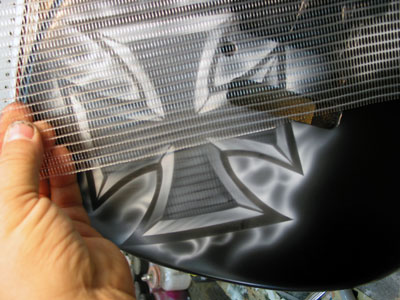
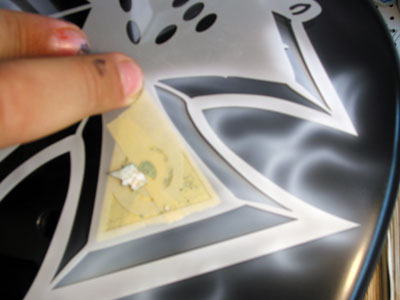
4. With the outside of the cross done, I decided to give the inside some texture. Here I have chosen one of the semi-rigid screens from our new Texture Kit.
5. I sprayed through the screen rather loosely to give the appearance you see here. You could hold this screen tighter to the surface and get a real geometric, or biomechanical look as well. But again, I was going for somewhat vintage.
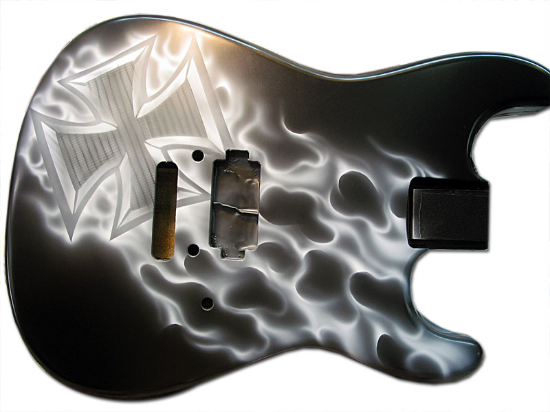
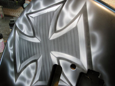
6. Here is a good picture of the white underpainting completed. Notice that the textures, volume and shapes are all defined before I move to any color. I have also set the light source at this time. All color and detail work from here out will follow the rules that have been set in white.
For the realistic fire I used a basic curves shield and created the flow, shape and volume that I was after. When working realistic fire be sure to keep the shapes and curves random. You do not want your fire to be repetitive. Use some reference shots and vary the volume of the licks as you work.
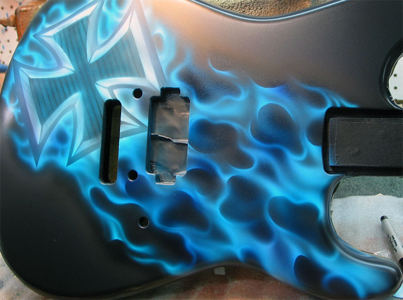
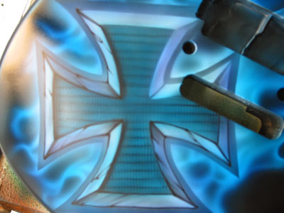
7. Now that my design is set, I am ready for color. For this piece I started with SEM aqua blue kandy and gave it an overall color wash. After that I switched to SEM royal blue kandy and worked the shadows and negative spaces.
8. Now it is time for the detail work. I have mixed up a dark purple/black mix and now I will go back through the piece and carve out the images. As always, I am merely following along the path that was laid out for me in my white. The dark detail color should just follow along and bring the dark color back to the foreground. I am not adding any new artwork or changing the design in any way.
9. Notice how the detail work and the shadowing is staying true to the originally established light source. It is extremely important to get your shadowing right. Incorrect shadowing is illogical to the brain and will make your design look confusing.
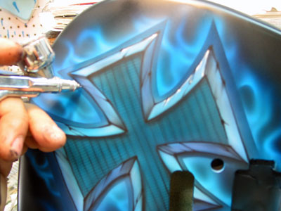
10. With the detail work done, all that is left is to go back in with white highlights.
11. Using white, I go back in and pick up the hottest points in the design to further establish depth and shape.
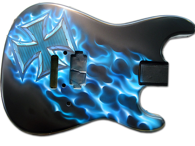
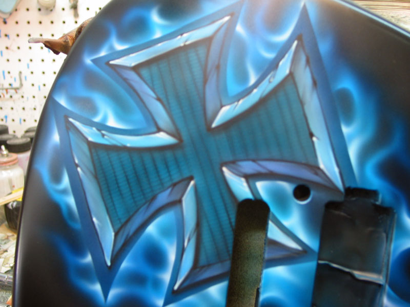
12. The highlight stage is extremely important for the realistic fire. Be sure to follow along the flame shapes that you have already established. You absolutely DO NOT want to go in at this time with more shapes. You simply want to pick out the hottest points within the fire you have set down and give it that extra pop. Look carefully at the images above and below and really notice how the highlights work within the fire.
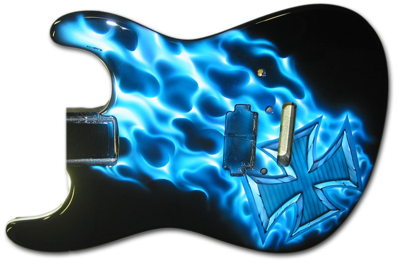
13. Here it is upside down and cleared. 🙂