This job came to me with very little instruction. The client, Rob Burns, wanted his bike to have a ton of artwork, but still wanted the LimeTime Pearl base coat to be very prevalent; basically he wanted the bike to still be green even after it was covered with art. He also mentioned that he liked jokers and the idea of a gambling theme. This job gave me the opportunity to do something different than the norm, and with so much artistic freedom I really wanted to make something with a story line; something twisted; something fun.
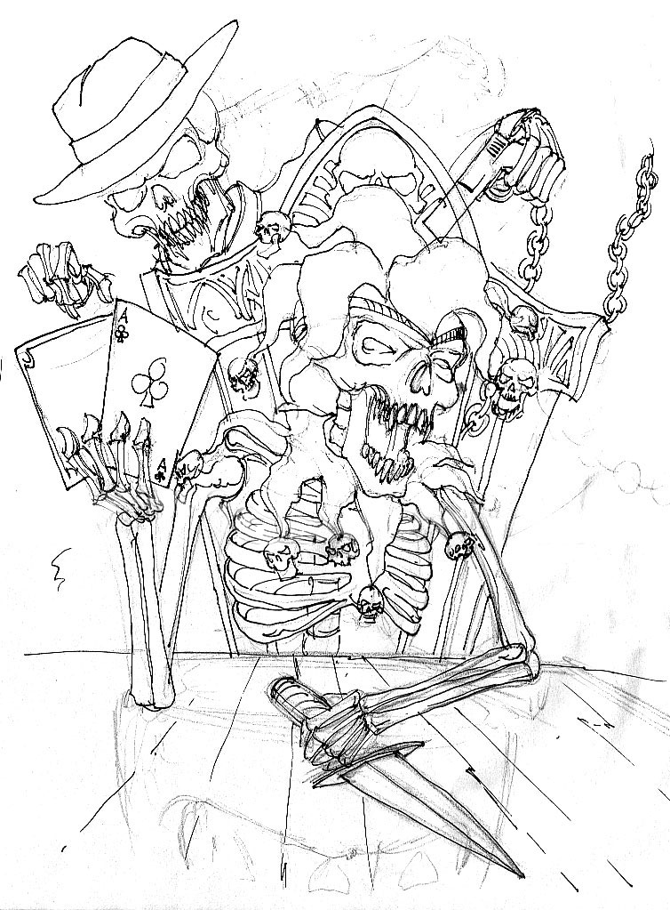
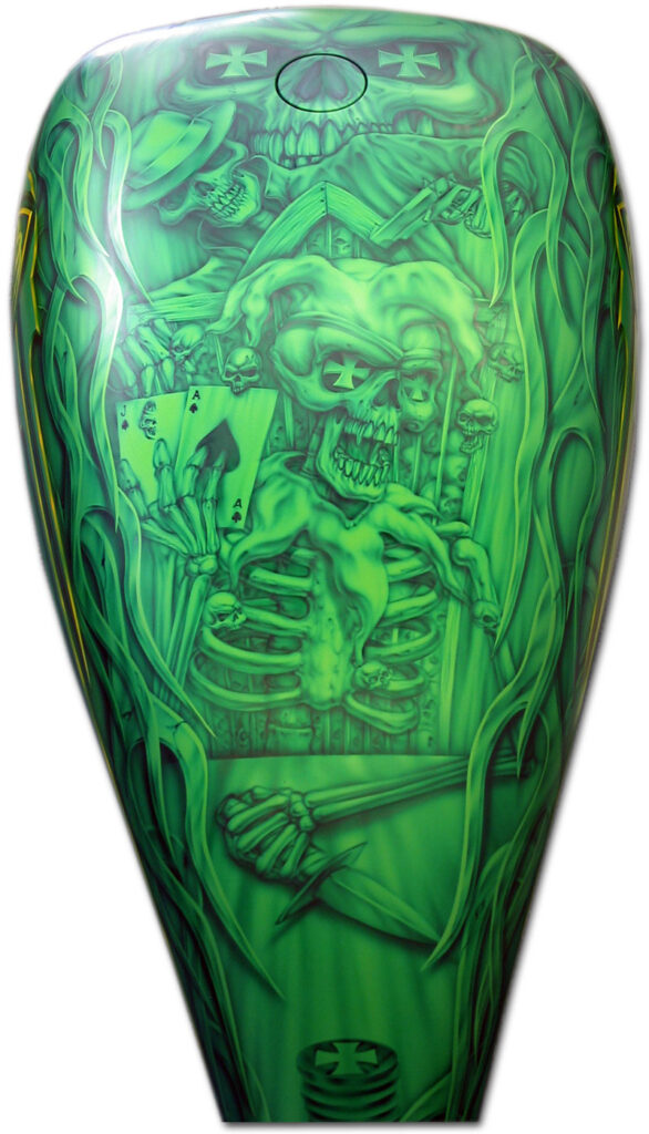
The Design: The basic idea behind the artwork itself is something of a totem pole of cause and effect, or the cycle of foul play. You see the main character here, acting very cocky, showing his had of cards and sitting with a knife in a defensive position. Meanwhile the guy behind him has a gun to his head and is taking the cards. I guess the moral of the story is “Having the greatest hand in the world does not mean squat if someone has a gun to your head ready to take it all away” or maybe, “Never show all your cards.”
The sketch you see here was done loosely in light pencil. I then did a bit of reinforcement with a 2B pencil. That was it. For this type of job there was no need to sharpie and scan. The sketch was the opportunity for me to work out the basic composition, elements and placement. Something of a guide.

The Composition: When working out a good composition, there are many factors that have to be taken in to consideration. When painting on a motorcycle, the shape of the tank or fender and the flow of the rest of the metal is crucial and have to be considered when doing the design. This particular tank, though not oddly shaped, was very long, and therefore the layout had to create a good flow so that the eye can make sense of what is going on and not jump around.
The basic “rule” I used for composing the characters is what I call the “Totem Pole” effect. A totem pole design is basically a stacking of art that is connected by interactivity and the use of foreground and background characters. Notice the main character as the focus, but then you have the secondary character behind and above that is interacting via the gun and reaching for the cards. Behind and above that you have the large skull that “tops” the artwork. Going the other way the main character leads to the table, knife and a stack of chips lets you know that you are at the end of the design. You could also call this layout somewhat serpentine, but I like to refer to it as totem.
In order to show perspective in this design, I used the lines of the table and the chair that can be seen through he rib cage of the main character. I also have some linear background. The hard lined flames were used to frame the mural, but also added linear flow to the composition. The flames were masked off with vinyl. I also utilized flowing tribal graphics along the side of the tank to tie in with the top mural.
If you study the artwork you will also see that there is use of repeating shapes and elements in the composition as well. The use of the Maltese cross gave the classic chopper feel to a somewhat wild west design, but also helps to tie and balance all the characters of the totem together, top to bottom. The use of the smaller skulls on the jesters collar and at the ends of his hat, though they have become somewhat of a trademark for my artwork, they also act as a circular frame around the main character emphasizing focus of the artwork.

Application: Monochromatic jobs are fun, relatively quick and give me a break from what is my primary method of working white and developing color. For this bike I used transparent toners and kandies in dark green and a hint of blue for detail work. For the tribal graphics on the sides that tied the whole bike together, I created a contrast by using a bit of white and pagan gold. You can see how the pagan gold works by looking closely at the sides of the tank.
Overall, this was a fun job and I think it was a great piece. I know the client was pleased with it. I hope that this discussion of the design thought process makes sense and can help you look at the art in a bit of a different way. . . Or maybe an additional way.
