This piece is the first in a series of Horror Classics that I had wanted to do for awhile. I have always loved the old movie posters for the Vincent Price horrors. I created the mock up for this piece based upon 2 different movie ads for “Tales of Terror” I really liked the contrast in the colors and I thought they would provide the most unique interaction on a guitar.
I decided to work on a white base because I wanted to use blood drops, drips and splatter all over the guitar, and besides, it is nice to change it up sometimes!

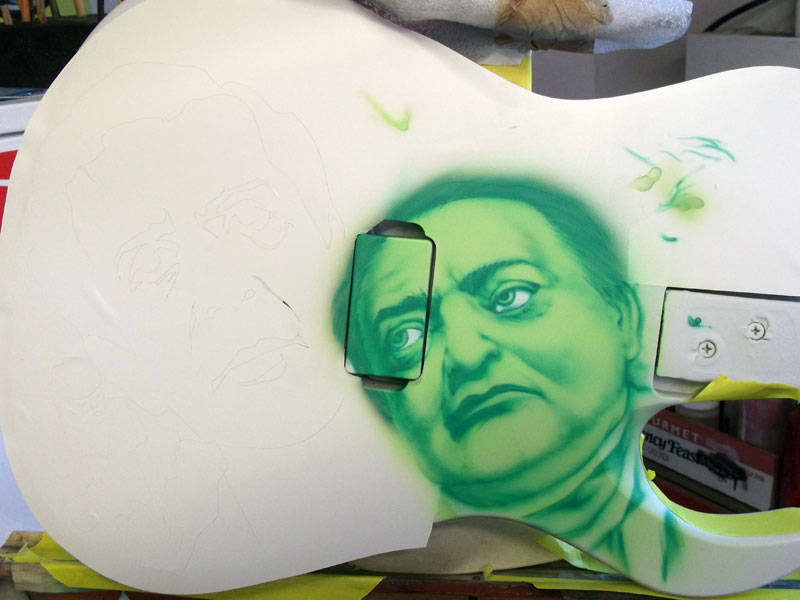
The mask was created in CorelDraw. I cut it out and placed it on the guitar.
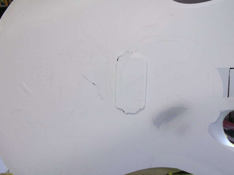
Using a very neutral medium gray I began to pull away piecs of the mask working on the Peter Lorre character first. At this point I am simply mapping out the features of the character. The gray is light enough that I will have no issues working through the mural, even if corrections need to be made along the way.

Here you can see that I moved to a much lighter, but still neutral gray to mark out the remaining area of the face. These colors are used simply for templating the image.
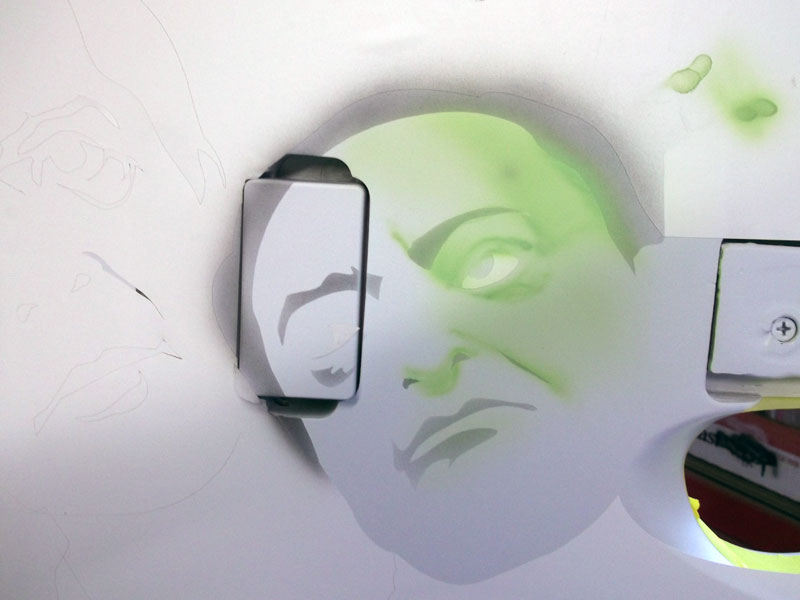
I am using an opaque green, thinned down considerably so that it is transparent and acts like a kandy, but it will not bleed upward later when I add my highlights. You need to be aware of this! Never use kandy when you plan on layering lighter colors on top. There is a time for kandy, and a time for opaque.
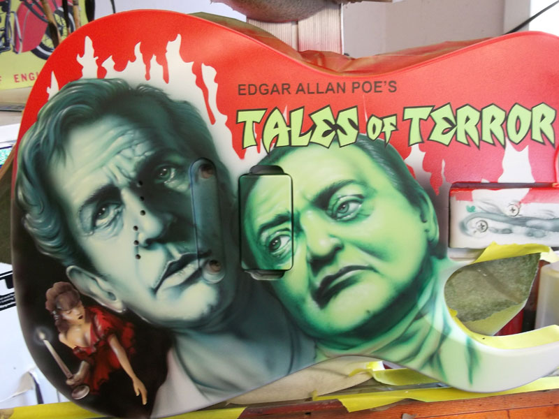
I decided to keep the colors similar to the original movie poster because I really like it and I also felt it paid nice homage to Vincent Price.
You can see here that the gray has been completely covered.
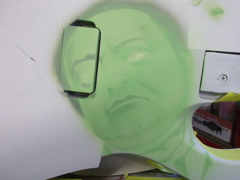
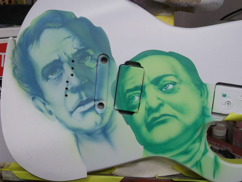
My darker, detail color is a bluish/teal sort of color. Now I go in and bring out the features, working from the darker gray templating that was laid down with the vector mask.
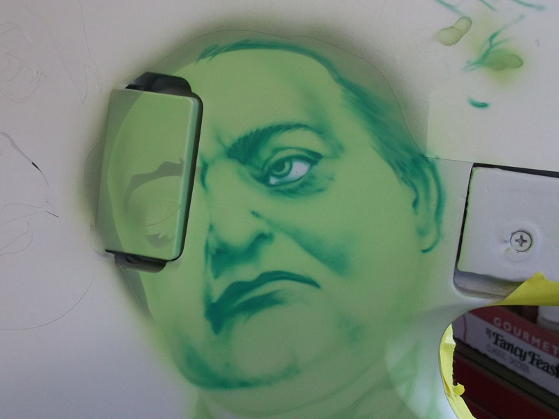
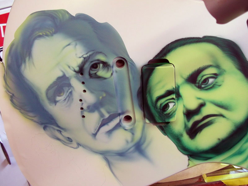
Peter is just about ready for his highlights, but I want to bring Vincent into the picture first!
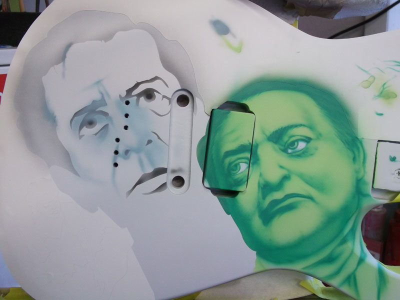
I used the same light and medium neutral grays to lay out the template of features. Vincent will be more blue and I mixed a very thin, washed out blue using navy with quite a bit of white in it. Here I am laying out the main features, layering the paint very carefully to bring out the shapes and shadows.

The gray templating is completely covered at this point.
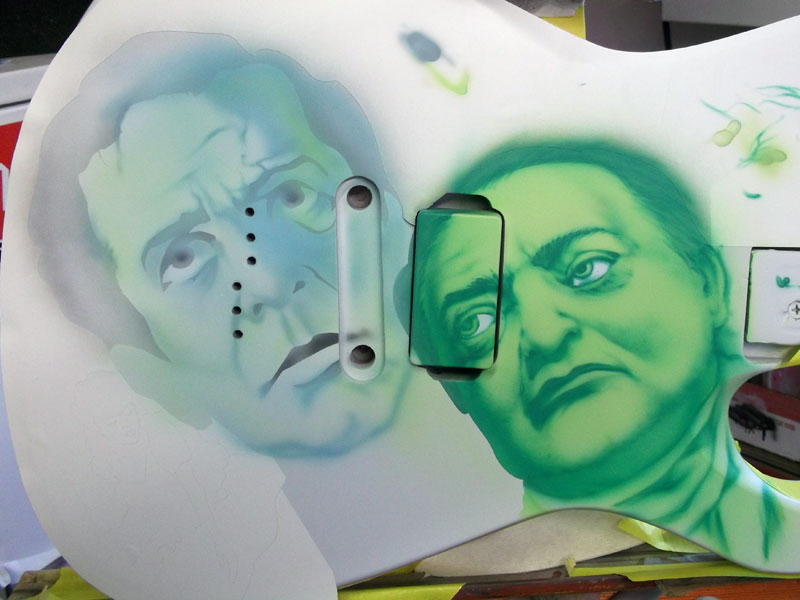
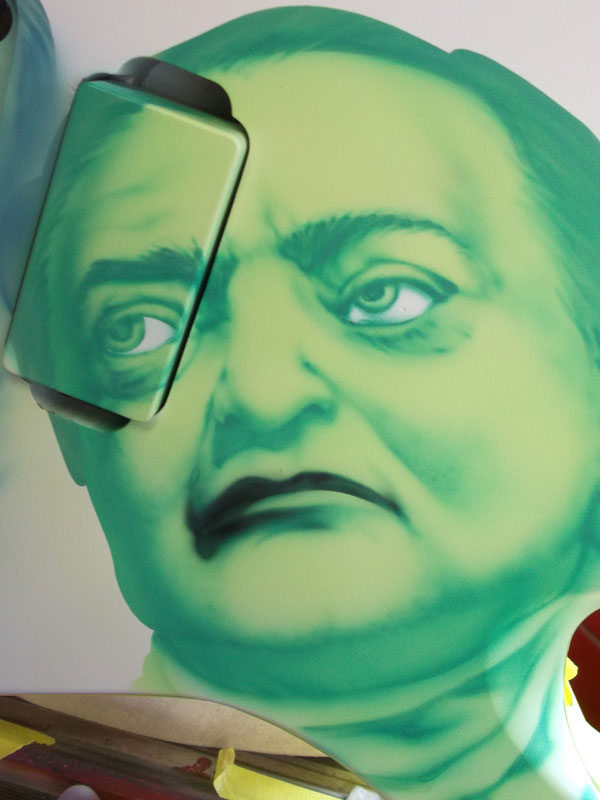
To bring the characters together I used the Lorre green to add some shading. The green in this piece is crucial because it will provide a ton of contrast agains teh red that will be very prominent in the background of the guitar when finished.

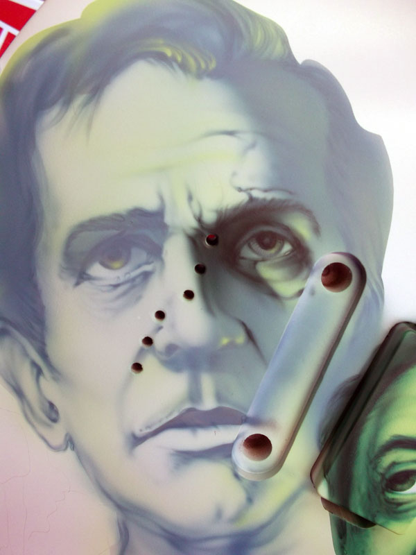
For the detail color on Vincent I am using a dark bluish-gray. I begin pulling the detail out, always following the template that was laid out in the very first steps.

I use my reference consistently to add in the shadows, paying attention to where in the image the brightest spots and the most shadowed spots occur. It is important to make sure that your light source remains consistent throughout the whole mural. Inconsistent lighting can distract and will cause visual confusion.
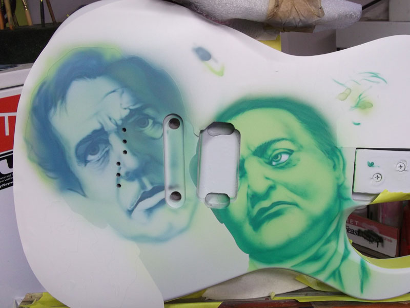
Here you can see that I have added Vincent’s hair and some additional green highlighting.
Normally I would have removed all the paint mask by now, but since this is a white guitar, and I have very specific plans for the background, I am leaving it in place for protection.
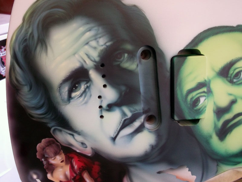
The final detail work was done with an even darker color – a mix of blue and black. I used this same detail color for both characters.

Notice that I am not rendering ANYTHING new at this point. I am simply sharpening the darker areas and the shadows following the “map.”

Ready for highlights!!
I do the same thing for Vincent. Pulling the detail out with the darker color. I am not counteracting anything that had had been laid down before.
I continue to refer to my reference, comparing relative values.

More detail work…
A close up of the detail lines….
Oh look!! A woman appeared! She is another character in the movie and I thought she should be included in the composition…. so there she is!
You can see that I have begun to add highlights. I am using white with a touch of yellow. The hightlights do not add anything new; highlights are used to accentuate the lightest parts of a painting.

The most challenging aspect of this job was the fact that I was working from the interpretation of another artist. It is infinitely easier to work from a photograph, because it allows for so much more freedom, while still maintaining the likeness of the character.
When I was done with the airbrush work I cut out a clean mask and placed it over the faces, then I created a mask for the blood runs. I splattered paint using a paint stilck and a large household paint brush. I “flicked” the brush for the random splatter.

Again… clear makes the piece absolutely POP. The contrasting colors are so interesting to look at. It is a really neat piece.
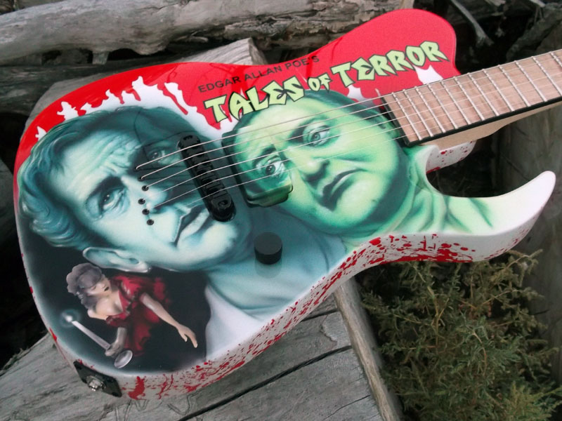
The guitar was sold just hours after the pictures of the finish were posted on FaceBook!
